The Visual Product Roadmap: How to Go From Spreadsheet to Strategy in Google Slides
June 30, 2026
Let's be honest. Your product roadmap is probably living in a spreadsheet. It’s a beast of a file with endless rows, cryptic status codes, and a dozen tabs that only you understand.
You present it in meetings, and you see the eyes glaze over.
The problem isn't your strategy. The problem is that a spreadsheet is a database, not a story. It fails to communicate the why behind your plan, inspire your team, or align your stakeholders. It’s time to move your roadmap out of the spreadsheet and into the spotlight.
Here’s how you can build a dynamic, visually compelling product roadmap right inside Google Slides.
Why a Visual Roadmap is a Better Roadmap
A product roadmap has one job: to communicate the strategic direction of your product. A wall of text and cells can't do that effectively.
A visual roadmap, on the other hand, turns abstract plans into a clear narrative. It shows relationships, highlights priorities, and makes progress tangible. It’s the difference between reading a blueprint and seeing a 3D model of a house.
Google Slides is the perfect place for this. It's collaborative, accessible, and where your presentations already live. But its native charting tools… well, they’re a bit basic for the job. You can’t create the advanced visualizations needed to truly tell your product's story.
That's where you need to bring in a specialist.
Step 1: Ditch the Gantt Chart Mentality
First, let's break free from the traditional, rigid Gantt chart. While useful for project managers, they're often too granular and complex for a high-level strategic roadmap.
Instead, think in themes or initiatives. Group your work into broader categories for a given quarter or half.
Your data in Google Sheets might look something like this:
| Quarter | Theme | Initiative | Status | | :--- | :--- | :--- | :--- | | Q3 | User Engagement | New Onboarding Flow | In Progress | | Q3 | Performance | API Refactor | Planned | | Q4 | Monetization | Subscription Tiers | Planned | | Q4 | User Engagement | Community Forum | Discovery |
This is clean, simple, and ready to be visualized.
Step 2: Choose the Right Chart for the Story
This is where we leave the limitations of native tools behind. With the ExtraChart add-on, you can create publication-quality charts without ever leaving Google Slides.
To get started, just go to Extensions -> ExtraChart -> Create & Edit Charts.
Instead of a single, overwhelming chart, use different visuals to communicate different parts of your strategy.
For Competitive Analysis: The Radar Chart
How does your product stack up against the competition? A spreadsheet can't answer that question at a glance. A Radar Chart can.
Use it to map out key features or strategic pillars (e.g., "Performance," "Ease of Use," "Pricing," "Support") and see instantly where you lead and where you lag. This is a game-changer for strategy meetings.
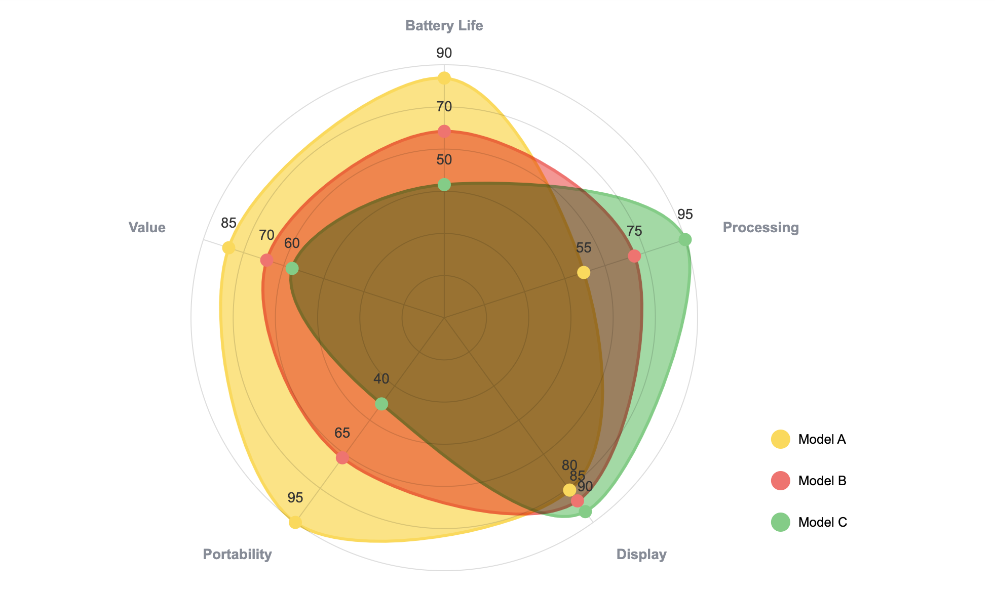
This isn’t just data; it’s a powerful statement about your position in the market.
For Timelines and Progress: The Grouped Bar Chart
A simple grouped bar or stacked bar chart is perfect for showing what's planned for each quarter. You can use different colors to represent the status of each initiative—"Planned," "In Progress," "Completed."
ExtraChart gives you granular control over spacing, labels, and colors, so you can create a branded, easy-to-read timeline that looks miles better than the default Google Slides charts.
For KPI Tracking: The Bullet Chart
Is a key feature tied to a specific business goal, like "Increase user retention by 15%"? A Bullet Chart is tailor-made for this. It visualizes a single key measure and compares it to a target, giving you an instant read on performance.
Step 3: From Data to Dynamic in Clicks
Here’s the best part. You don’t need to manually recreate anything.
- Open ExtraChart in the sidebar and pick your chart (like a Radar Chart).
- Copy your data directly from Google Sheets or Excel.
- Paste it into the add-on's built-in data editor.
The chart preview updates in real-time. You can tweak colors, fonts, and labels in the Settings tab until it's perfect, then click "Create" to insert a high-resolution image onto your slide.
Step 4: The Magic of Updatable Charts
Here's what truly makes your roadmap "dynamic."
Plans change. Priorities shift. Next week, that "Planned" feature is now "In Progress." With a traditional workflow, you’d have to go back to your spreadsheet, update the data, create a new chart, export it, and replace the old one.
With ExtraChart, you just click the chart image on your slide and open the add-on.
It automatically loads all your original data and settings. You change the status, click "Update," and the chart on your slide is instantly refreshed. Your roadmap is now a living document, not a static artifact.
Stop Presenting Spreadsheets
Your roadmap deserves better than to be trapped in a grid. It's the story of your product's future, and it should be told with clarity and impact.
By combining the collaborative power of Google Slides with the visualization muscle of ExtraChart, you can transform a dense spreadsheet into a dynamic, persuasive strategic tool that gets everyone on the same page.
Ready to build a roadmap people actually want to look at? Install ExtraChart for free from the Google Workspace Marketplace and turn your strategy into a masterpiece.