The Board Deck Blueprint: 7 Essential Charts for a Killer Board Meeting in Google Slides
June 27, 2026
We’ve all been there. It’s the week before the board meeting. The pressure is on, and you’re wrestling with a dozen spreadsheets, trying to force a compelling story into your Google Slides deck.
You copy-paste a chart from Sheets, tweak the colors, and it still looks… bland. It doesn't scream confidence. It doesn't tell the story you need it to.
The truth is, a board deck isn't just a report; it's a narrative. And every great narrative needs powerful visuals. Your board doesn't have time to decipher a data dump. They need to see the signal through the noise, instantly.
Here’s the blueprint. I’m going to walk you through the seven essential charts that should be in your deck, and how you can create them without ever leaving Google Slides.
1. The Big Picture: Revenue vs. Forecast (Grouped Bar Chart)
This is the cornerstone. Where did we plan to be, and where are we actually? A Grouped Bar Chart is perfect for this direct comparison. It immediately answers the most critical financial questions.
What it shows: Monthly or quarterly revenue (actual) right next to your financial forecast (planned).
Why it matters: It’s a transparent look at performance. It sets the stage for every other slide and builds trust. Did we hit our goals? Exceed them? Or do we need to discuss a miss?
With ExtraChart, you can create a crisp Grouped Bar Chart in seconds. Just paste your data from Sheets, and use the settings to match your brand colors perfectly. No more fuzzy screenshots from other apps.
2. The Health Check: KPI Dashboard (Bullet Chart)
How are we tracking against key performance indicators? A Bullet Chart is the single best way to show progress toward a goal. It’s compact, clear, and incredibly information-dense.
What it shows: A single metric (like MRR, CAC, or Churn Rate), its target, and qualitative ranges (like poor, satisfactory, and good).
Why it matters: It tells the board if you’re on track at a glance. Google Slides doesn't have a native Bullet Chart, which is why most people skip this vital visual. With ExtraChart, you can find it right in the sidebar, ready to make your KPIs look sharp and professional.
3. The Customer Journey: Sales & Marketing (Funnel Chart)
Where are our leads coming from, and where are they dropping off? The Funnel Chart is the definitive visual for illustrating conversion rates through a process.
What it shows: The flow of users from initial awareness (e.g., website visitors) to final conversion (e.g., paying customers).
Why it matters: It instantly highlights the biggest leaks in your pipeline. This chart doesn’t just report numbers; it sparks a strategic conversation about where to focus your resources. ExtraChart lets you build a clean, easy-to-read Funnel Chart that makes your conversion story undeniable.

4. The Growth Engine: Cohort & Composition (Stacked Bar Chart)
Are we growing, and is that growth healthy? A Stacked Bar Chart can brilliantly show how different segments contribute to a whole over time.
What it shows: Total monthly revenue broken down by customer acquisition channel, or new vs. expansion revenue.
Why it matters: It shows if your growth is reliant on one channel or if you have a diversified, resilient strategy. It answers the question, "Is our foundation solid?"
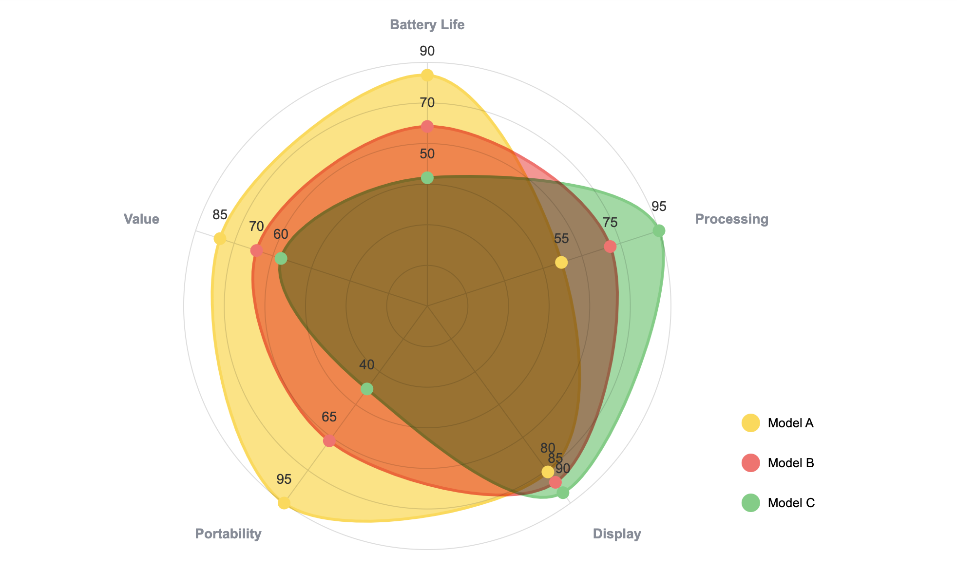
5. The Arena: Competitive Landscape (Radar Chart)
How do we stack up against the competition? When you need to compare multiple subjects across multiple variables, the Radar Chart (or Spider Chart) is your secret weapon.
What it shows: Your product vs. competitors across features like Price, Performance, Support, and Ease of Use.
Why it matters: It provides a powerful, at-a-glance summary of your strategic position in the market. It’s a complex analysis made simple—and it looks fantastic in a presentation. This is another pro-level chart that you can build directly in Slides with ExtraChart.
6. The Breakdown: Revenue by Product/Region (Donut Chart)
What’s driving the business? While some people knock the pie chart, its modern cousin, the Donut Chart, is a clean and effective way to show the composition of a whole.
What it shows: Percentage of total revenue coming from each product line, customer segment, or geographic region.
Why it matters: It clearly communicates where the money is coming from, helping the board understand your core business drivers. ExtraChart’s Donut Chart tool gives you control over the inner radius and labels, so it always looks polished.
7. The Road Ahead: Historicals & Projections (Line Chart)
Where have we been, and where are we going? The classic Line Chart is essential for showing trends over time and presenting your future outlook.
What it shows: A solid line for historical performance (e.g., user growth) and a dashed or lighter-colored line for the forecast.
Why it matters: This chart bridges the past and the future. It demonstrates that you have a command of your history and a clear vision for what's next. It’s the perfect way to end your presentation on a forward-looking, confident note.
Build Your Story, Not Just Your Slides
Your next board deck doesn't have to be a last-minute scramble. By focusing on these seven chart types, you can build a clear and compelling narrative that commands attention.
And the best part? You can do it all inside Google Slides. ExtraChart was built to fill the gaps, providing advanced, updatable charts that look like they came from a dedicated design team.
Give it a try. Open Extensions > ExtraChart > Create & Edit Charts and start building a deck that does more than just report—it persuades.