The 5-Chart Storytelling Arc That Turns Data into Decisions
July 1, 2026
You’ve been there. Slide 27 of a quarterly review, staring at a dense bar chart that feels more like a punishment than a piece of information. The presenter is clicking, talking, but the story is gone. Your audience is lost.
The problem isn’t the data; it’s the delivery. We’re often told to "show the data," so we dump it onto slides. But data without a narrative is just noise. Your job isn't to show numbers; it's to guide your audience from a starting point (the problem) to an endpoint (your solution).
Great presentations follow a classic story arc. You can build that same arc with just five charts. Here’s a framework I use to turn a spreadsheet into a compelling story that gets nods of approval, not sleepy stares.
The 5-Chart Storytelling Arc
- The Hook: What’s the big picture?
- The Trend: How did we get here?
- The Climax: What’s the core conflict or comparison?
- The "Why": Where is the specific problem or opportunity?
- The Resolution: What should we do next?
Let's break down each act.
Act I: The Hook - Set the Scene with a Donut Chart
You need to ground your audience immediately. Don't start with complex trends. Start with a simple, high-level snapshot of the current situation.
A Donut Chart is perfect for this. It’s clean, easy to read, and excellent for showing composition—like market share, budget allocation, or website traffic sources. It answers the question: "What does our world look like right now?"
Pro Tip: While Google Slides has a basic pie chart, I prefer the Donut Chart in ExtraChart. You can control the inner radius to create more space for a key metric and fine-tune the labels so they don't overlap. It just looks more professional.

Act II: The Trend - Show Momentum with a Line Chart
Okay, we know where we are. Now, where have we been? The second chart should introduce the element of time.
A Line Chart is the classic choice for showing a trend. Is revenue growing? Are user sign-ups accelerating or plateauing? This chart builds the narrative's momentum and hints at the challenge or opportunity ahead.
Pro Tip: For a modern look, try ExtraChart’s Curved Line Chart. It softens the sharp angles of a standard line chart, making the trend feel more fluid and organic.

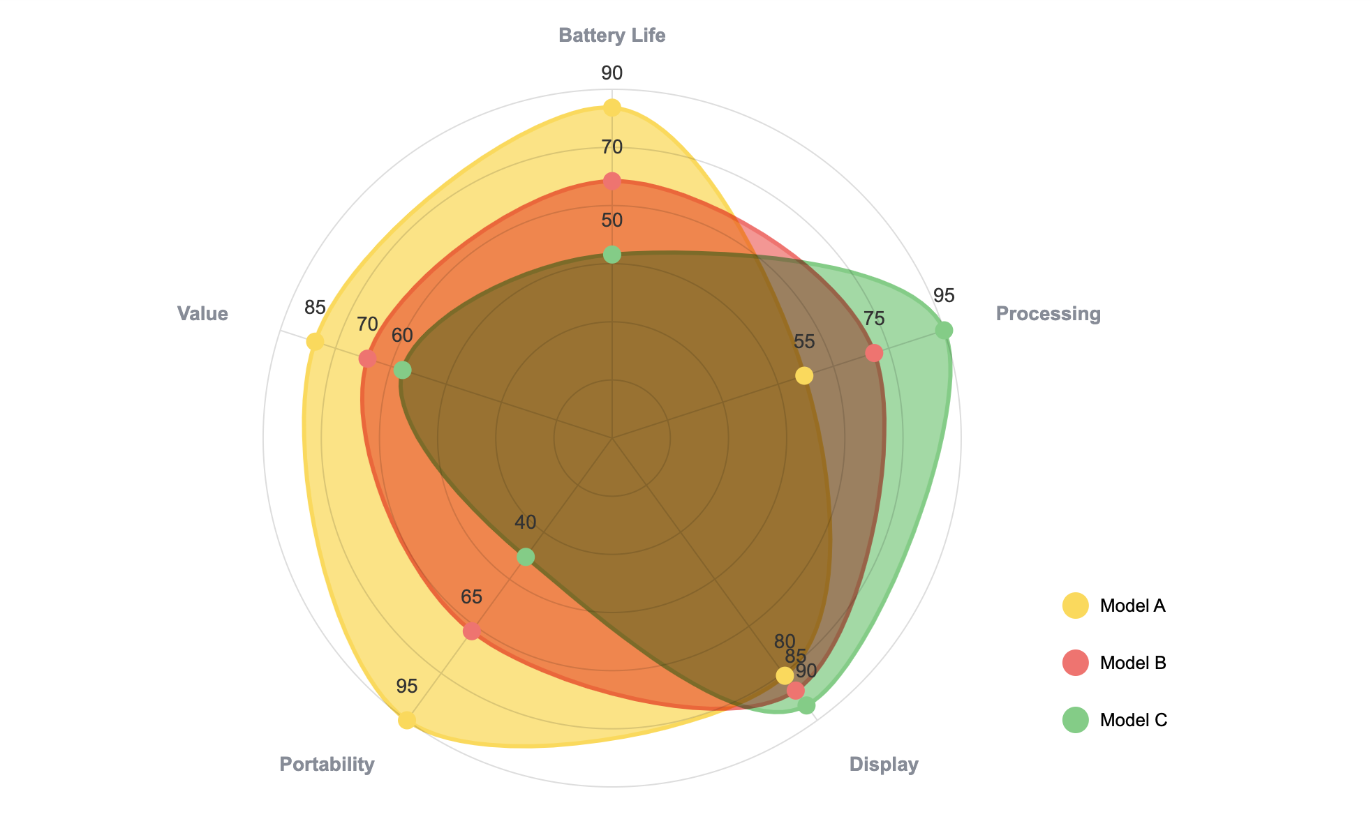
Act III: The Climax - Create Tension with a Radar Chart
This is the turning point of your story. You’ve set the scene and shown the trend; now you introduce the conflict. This is where you compare your performance against competitors, one product against another, or a new strategy versus the old one.
A standard bar chart can work, but for a truly powerful comparison across multiple dimensions, nothing beats a Radar Chart. It can visualize how different laptops stack up on price, performance, battery, and design all in one elegant graphic. It creates a powerful "us vs. them" moment.
Google Slides doesn’t offer this chart type. This is where a tool like ExtraChart becomes essential. You can open the sidebar, select the Radar Chart, and paste your data to create a visual centerpiece for your story.
Act IV: The "Why" - Pinpoint the Problem with a Funnel Chart
Your audience is now hooked. They see the trend and the conflict. Their next question is, "Why is this happening?" Your fourth chart needs to answer that question by drilling down into a specific process.
A Funnel Chart is brilliant for this. It instantly shows drop-offs in a process, whether it’s a sales pipeline, a marketing campaign, or a user onboarding flow. You can immediately point to the stage where things are going wrong—the bottleneck.
Again, this is a specialized chart you won't find in the standard Google Slides toolkit. With ExtraChart, you can build it in under a minute without ever leaving your presentation.

Act V: The Resolution - Propose the Solution with a Bullet Chart
You’ve identified the problem. Now, what’s the solution? The final chart in your arc shouldn't be about past data; it should be about the future.
The Bullet Chart is the unsung hero of business presentations. It’s designed to show a single metric, compare it to a target, and display its performance context (e.g., poor, average, good). It’s the perfect way to visualize a KPI and your proposed goal. It says, "Here's our current performance, and here is the target my proposal will help us hit."
It’s a clear, concise, and powerful call to action. It transforms your presentation from a report into a plan.

From Noise to Narrative
Stop presenting data and start telling stories. By structuring your charts into this five-act arc, you guide your audience on a journey. You give them context, build tension, pinpoint the problem, and deliver a clear, actionable solution.
The best part? You can build this entire narrative without ever leaving Google Slides. With the right tools, you can focus on the story, not on fighting with clunky software.
Ready to build your first story? Install ExtraChart from the Google Workspace Marketplace and see how easy it is to create charts that convince.