Stop the Copy-Paste Madness: Google Sheets vs. Slides Charts Explained
June 26, 2026
You know the drill.
You spend an hour in Google Sheets, wrangling data until it’s perfect. You create a chart. You meticulously copy it, paste it into your Google Slides deck, and admire your work.
Then you spot it. A typo in a label. Or worse, your boss asks for a last-minute data update.
And so begins the painful shuffle: back to Sheets, change the data, update the chart, re-copy, re-paste, re-align, and pray you didn’t just break the slide's formatting. This workflow is so common, yet it's fundamentally broken.
The problem isn't the tools; it's that we're using them for the wrong jobs.
Sheets is for Analysis. Slides is for Communication.
This is the one truth you need to remember.
Google Sheets is a powerhouse for analysis. It’s built for complex formulas, pivot tables, and exploring massive datasets. The charts it produces are functional tools to help you understand the numbers. They are a means to an end.
Google Slides is a tool for communication. Its job is to convey a message, tell a story, and persuade an audience. A chart on a slide isn't just data; it's a key piece of evidence in your argument. It needs to be clear, on-brand, and instantly understandable.
When you import a chart from Sheets, you’re importing an analysis tool into a communication platform. The two are often at odds.
The "Linked Chart" Trap
Google offers a "Link to spreadsheet" option, which seems like a clever solution. In reality, it's a trap waiting to spring.
Linked charts are brittle. Change the Sheet’s file name? The link breaks. Move the file? The link breaks. Forget to give your colleague viewing permissions for the Sheet? They just see an ugly error box. The dreaded "Update" button becomes a source of anxiety, not convenience.
The "Unlinked" Dead End
The alternative is pasting the chart "unlinked." Now it's just a static image. Simple, right?
But when you need to change that single data point, you're back to square one. You have to repeat the entire creation and pasting process. It’s a massive time-waster that kills your flow.
Create Your Charts Where They Belong: In Slides
What if you could skip the import/export dance entirely? What if you could build presentation-quality, fully editable charts directly inside Google Slides?
That's precisely why we built ExtraChart. It’s not a replacement for Google Sheets; it’s the professional charting tool that Google Slides is missing.
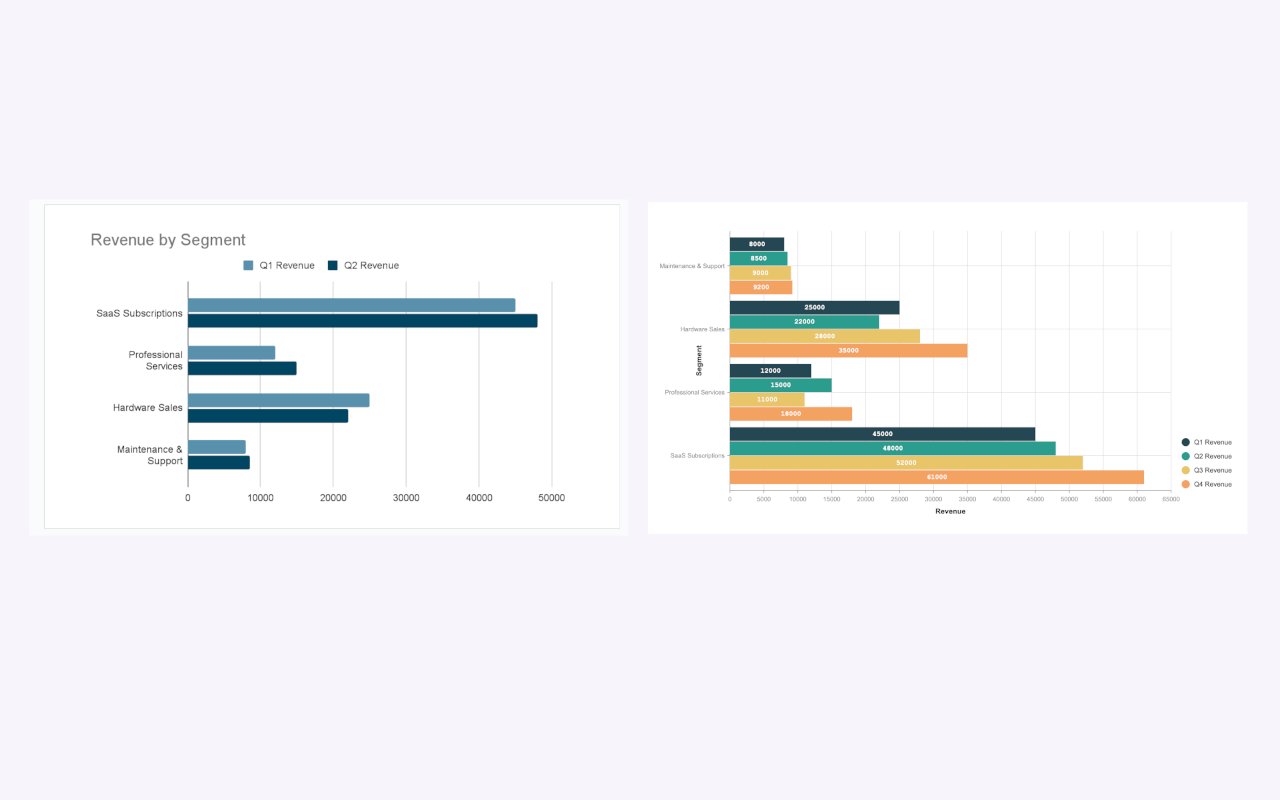
Instead of forcing an analysis chart to look good in a presentation, you build a communication chart from the start.
A Workflow That Actually Works
With an add-on like ExtraChart, the process is simple and stays entirely within your presentation:
- Open the sidebar: Go to
Extensions > ExtraChart > Create & Edit Charts. - Pick a chart type: Choose from 20 types, including advanced options like Funnel, Radar, and Heat Maps that aren’t even available from Sheets.
- Add your data: Paste your values directly into the built-in editor. No separate spreadsheet file is needed.
- Customize everything: This is where the magic happens. Adjust colors to match your brand, tweak fonts for readability, and control spacing down to the pixel. You’re designing for communication, not just plotting data.
- Insert and update: The chart is inserted as a high-resolution image. But here's the key difference: it’s not a dead end. Just select the chart image later, re-open ExtraChart, and you're right back in the editor with all your data and settings intact. It's the "updatable" benefit of a linked chart without any of the fragile links.
The Final Verdict: When to Use Each
Let's make this simple.
Use Google Sheets When:
- You are performing complex data analysis with formulas and pivot tables.
- You are managing a large, raw dataset.
- The chart's primary purpose is for your own exploration and understanding.
Use ExtraChart in Google Slides When:
- You are preparing a presentation for an audience.
- Visual clarity, branding, and storytelling are critical.
- You need advanced chart types that tell a specific business story (e.g., conversion funnels).
- You know the data might need to be updated later and you don't want the hassle.
Stop the copy-paste madness. Use Sheets for what it’s great at—number crunching—and use a dedicated tool like ExtraChart to build charts that truly communicate your message. Your presentations (and your sanity) will thank you.