Stop Guessing: How to Visualize Employee Turnover in Google Slides and Find Out Why People *Really* Leave
June 18, 2026
You just got the quarterly HR report. Turnover is up again.
The leadership team wants to know why, and they want to see it in tomorrow's all-hands presentation. You have a spreadsheet full of exit interview data, but a simple bar chart of "people who left" just isn't going to cut it.
That's the moment of panic for a lot of managers and HR professionals. How do you turn a complex problem like employee attrition into a simple, clear visual that actually leads to a solution?
The default charts in Google Slides are fine for basic numbers, but they fall short when you need to tell a deeper story. They can show you that turnover happened, but not the interconnected reasons why.
More Than a Number: The Real Story Behind Attrition
Employee turnover isn't a single-issue problem. People leave for a cocktail of reasons: compensation, a difficult manager, a lack of growth opportunities, or a culture that just isn't the right fit.
To truly understand the problem, you need to visualize these multiple factors at once. You need to see the patterns.
Is everyone leaving because of money? Or is there a silent killer, like poor work-life balance, affecting a specific department? A standard pie chart won't tell you that. This is where you need a more specialized tool, right inside Google Slides.
Step 1: Track the "Who" and "Where" with a Grouped Bar Chart
First, let's get a baseline. The most basic question is: who is leaving and from where? A Grouped Bar Chart is perfect for this. Native Google Slides charts can be clunky, but we designed ExtraChart to make this easy.
You can quickly create a chart comparing voluntary vs. involuntary turnover across different departments.
- Group 1: Marketing
- Group 2: Engineering
- Group 3: Sales
Within each group, you have two bars: "Voluntary" and "Involuntary." Instantly, you might spot that the Engineering department has a massive voluntary turnover problem, while other departments are stable. Now you have a specific area to investigate.
Step 2: Pinpoint the "Why" with a Radar Chart
Now for the million-dollar question: why are engineers leaving?
This is where the standard toolset runs out of steam, and a Radar Chart (or Spider Chart) becomes your best friend. It’s designed to plot multiple variables on different axes, creating a "shape" that tells a story at a glance.
Imagine you've summarized your exit interview data on a 1-5 scale for key areas:
- Compensation
- Management Support
- Career Growth
- Work-Life Balance
- Team Culture
With ExtraChart, you can plot the average scores for departing employees on a Radar Chart. The resulting shape will immediately show you the weak spots. A low score on "Career Growth" that creates a dramatic dip in the chart is a powerful, undeniable signal to leadership.
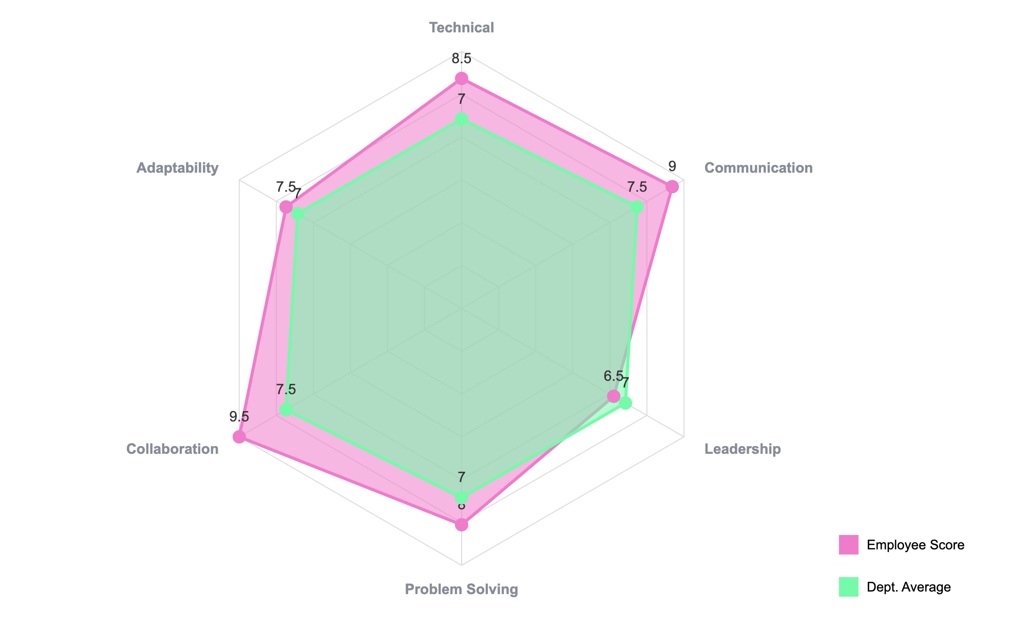
While this example shows a skills assessment, you can use the exact same format to map out the reasons for leaving. The visual impact is identical.
How to Build a Turnover Radar Chart in 60 Seconds
We built ExtraChart to be fast, so you can move from spreadsheet to slide without friction.
- Open ExtraChart: In Google Slides, go to
Extensions->ExtraChart->Create & Edit Charts. - Select the Radar Chart: Find the icon in our sidebar. A popup editor will appear with a live preview.
- Paste Your Data: Copy your summarized exit interview data from Google Sheets or Excel. Click into the first cell of the Data tab in ExtraChart and paste. The chart preview will update instantly.
- Customize for Impact: Go to the Settings tab. Change the color of the data series to your company's brand red. Increase the font size of the labels. Make it pop.
- Insert and Present: Click "Create," and a high-resolution, crystal-clear chart is inserted onto your slide.
The best part? It's a living chart. If you get more data next week, just click the chart image on your slide, re-open ExtraChart, and all your data and settings are right there, ready for an update. No need to start from scratch.
Stop Reporting, Start Solving
Don't just show your leadership team a number. Show them the shape of the problem.
A well-designed visualization turns a confusing spreadsheet into a clear call to action. It transforms the conversation from "We're losing people" to "We need to fix our career development path for engineers."
That's how you drive real change.
Ready to build charts that make a difference? Install ExtraChart for free from the Google Workspace Marketplace and turn your data into your most persuasive asset.