Stepped Line Charts in Google Slides: Website Traffic Made Simple
January 29, 2026
Ever stared at a wobbly line chart trying to decipher your website traffic and felt utterly lost? Me too. That smooth, continuous line looks… nice, but it doesn't always tell the real story of how your traffic jumps and plateaus.
Enter the stepped line chart. It's a simple tweak that can make a HUGE difference.
Why Stepped Line Charts?
Stepped line charts (also called step charts) are perfect for visualizing data that changes at discrete intervals. Think of it like this: your website traffic doesn't gradually increase from 100 to 150 visitors on a given day. It might stay at 100 for hours, then suddenly jump to 150 because of a marketing campaign or a viral post.
That's where the "steps" come in. Instead of a sloping line, a stepped line chart shows horizontal lines representing periods of constant value, connected by vertical lines that illustrate the changes. Clear, right?
Real-World Example: Website Traffic
Imagine you launch a new blog post at 2 PM. Here's what a stepped line chart can show you:
- Before 2 PM: Traffic is steady at 50 visitors per hour. (Horizontal line).
- At 2 PM: Traffic jumps to 200 visitors per hour. (Vertical line).
- After 2 PM: Traffic remains elevated for several hours. (New horizontal line).
You instantly see the impact of your blog post launch, rather than a smoothed-out average that obscures the details.
How to Create Stepped Line Charts in Google Slides
Okay, so how do you actually make one of these beauties? Google Slides' native charting tools are… limited. Trust me, I've been there.
That's where ExtraChart comes in.
ExtraChart is a Google Slides add-on that expands your charting options dramatically. It lives right inside Slides, so you don't have to jump between different apps.
ExtraChart to the Rescue
Here’s how ExtraChart makes creating stepped line charts a breeze:
- Install the Add-on: Grab ExtraChart from the Google Workspace Marketplace.
- Open ExtraChart: Find it in the "Add-ons" menu within Google Slides.
- Choose "Stepped Line Chart": ExtraChart's sidebar gives you a list of chart types to choose from. Pick "Stepped Line Chart".
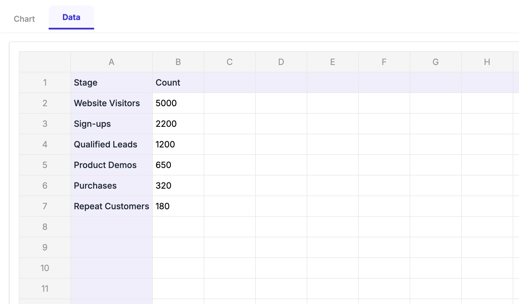
- Enter Your Data: The popup editor is so easy to use. You can even copy and paste your data directly from a spreadsheet.
- Customize: Change colors, fonts, and labels to match your brand. ExtraChart gives you tons of control.
- Insert and Update: Boom! Your chart is in your presentation. And the best part? You can always edit it later if your data changes.
Beyond Website Traffic
Stepped line charts aren't just for website traffic. Think about these scenarios:
- Sales Data: Track sales performance after a promotion.
- Inventory Levels: Visualize changes in stock after each shipment.
- Project Management: Show the progress of tasks as they're completed.
Level Up Your Presentations
Stepped line charts are a simple yet powerful way to make your data more understandable and impactful. And with ExtraChart, creating them in Google Slides is easier than ever. Stop struggling with generic charts and start telling a clearer story with your data.