Small Multiples in Google Slides: The Pro-Level Trick for Comparing Data
June 17, 2026
You’ve been there. You have quarterly sales data for five different regions, and you need to show it on a single slide.
So you dump it all into one line chart. The result? A tangled mess of overlapping lines that your audience has to squint at. A "spaghetti chart." It’s cluttered, confusing, and completely undermines your point.
There’s a much, much better way. It’s a design principle called small multiples.
What Are Small Multiples?
Coined by data visualization pioneer Edward Tufte, the idea is simple: instead of one complex chart, you use a series of small, simple charts laid out in a grid.
Each chart uses the same scale and design but shows a different slice of the data. One chart for the North region, one for the South, one for the East, and so on.
By keeping the design consistent, you make it incredibly easy for your audience to compare the data across categories. Their eyes aren't fighting a rainbow of tangled lines; they're scanning for patterns. Which region had the biggest Q3 spike? Is there a seasonal trend across all regions? The answers jump right off the slide.
Why It’s a Game-Changer for Presentations
- Clarity Over Clutter: It’s the single biggest win. You allow each piece of data to breathe, making your entire slide easier to understand in seconds.
- Effortless Comparison: The consistent structure helps the audience focus on the data, not on deciphering the chart itself.
- Powerful Storytelling: You can guide your audience's attention. Arrange the charts to show a progression, highlight an outlier, or build up to a key insight.
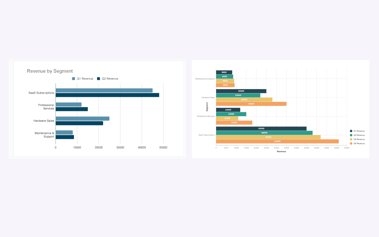
The goal of any chart is to make complex information simple. A single, overloaded chart often does the exact opposite. Whether you use a full grid of small multiples or even just a well-structured grouped bar chart, the principle is the same: clarity is king.
The Problem: Google Slides Makes This Hard
So, how do you create small multiples in Google Slides? The native tools make it a real chore.
You’d have to:
- Create your first chart.
- Copy and paste it multiple times.
- Manually edit the data source for each individual chart.
- Painstakingly align them all on the slide.
- And if the data ever updates? You have to start all over again. It's a frustrating, time-consuming process.
The Solution: A Smarter Workflow with ExtraChart
This is exactly the kind of professional workflow we built ExtraChart to handle. Our add-on for Google Slides streamlines the entire process, turning a tedious task into a quick one.
Here’s how you can create a small multiples layout in minutes with ExtraChart:
Step 1: Create Your Master Chart
First, let's build the template for all your other charts.
Go to Extensions -> ExtraChart -> Create & Edit Charts. Select a simple chart type that’s easy to read at a small size, like a Bar Chart or a Line Chart. Paste in the data for just your first category (e.g., the "North" region).
Step 2: Dial in the Design
In the Settings tab, customize your chart to perfection. Adjust the colors to match your brand, pick a clean font like Inter, and remove any unnecessary clutter like gridlines or excessive labels. This polished design will be your master template.
Click "Create" to insert the first chart onto your slide.
Step 3: Duplicate and Update with Ease
Here's the magic. Select the chart you just created on your slide and open ExtraChart again.
Instead of starting from scratch, ExtraChart loads that chart’s data and all its settings. Now, all you have to do is:
- Click the Data tab.
- Delete the old data and paste in the data for your next category (e.g., the "South" region).
- Click "Create" again.
A new, perfectly styled chart appears on your slide. Repeat this simple process for all your categories. Because ExtraChart remembers your settings, every chart is perfectly consistent.
Step 4: Arrange Your Grid
Now you have a series of perfectly matched charts. Use the built-in alignment tools in Google Slides (Arrange -> Align and Arrange -> Distribute) to snap them into a clean, professional grid.
What used to be a 30-minute ordeal of manual edits is now a two-minute process of copy-pasting data. And if a number changes? Just select the chart, open ExtraChart, update the value, and the chart is refreshed instantly.
Stop fighting with tangled charts. Give your data the clarity it deserves.
Ready to build better, clearer presentations? Install ExtraChart from the Google Workspace Marketplace and try it for free.