How to Visualize Customer Personas in Google Slides Using a Radar Chart
March 26, 2026
I've sat through countless marketing presentations where customer personas are just a stock photo next to a wall of text.
"Meet Enterprise Eric. He likes golf and wants ROI."
Let's be honest. It's boring. And worse, it's not visually useful.
When you're trying to compare different buyer personas, text blocks simply don't cut it. You need stakeholders to see audience traits side-by-side at a glance.
That's where radar charts (often called spider charts) come in.
Why Radar Charts Work for Personas
Radar charts let you plot multiple variables on a 360-degree axis.
Imagine mapping out "Price Sensitivity", "Brand Loyalty", "Tech Savviness", and "Support Needs" all on one visual plane. Instantly, your audience sees the exact shape of your target buyer.
You can even overlay two different personas on the same chart. Suddenly, the gap between your "Budget Buyer" and your "Premium Prospect" is glaringly obvious.
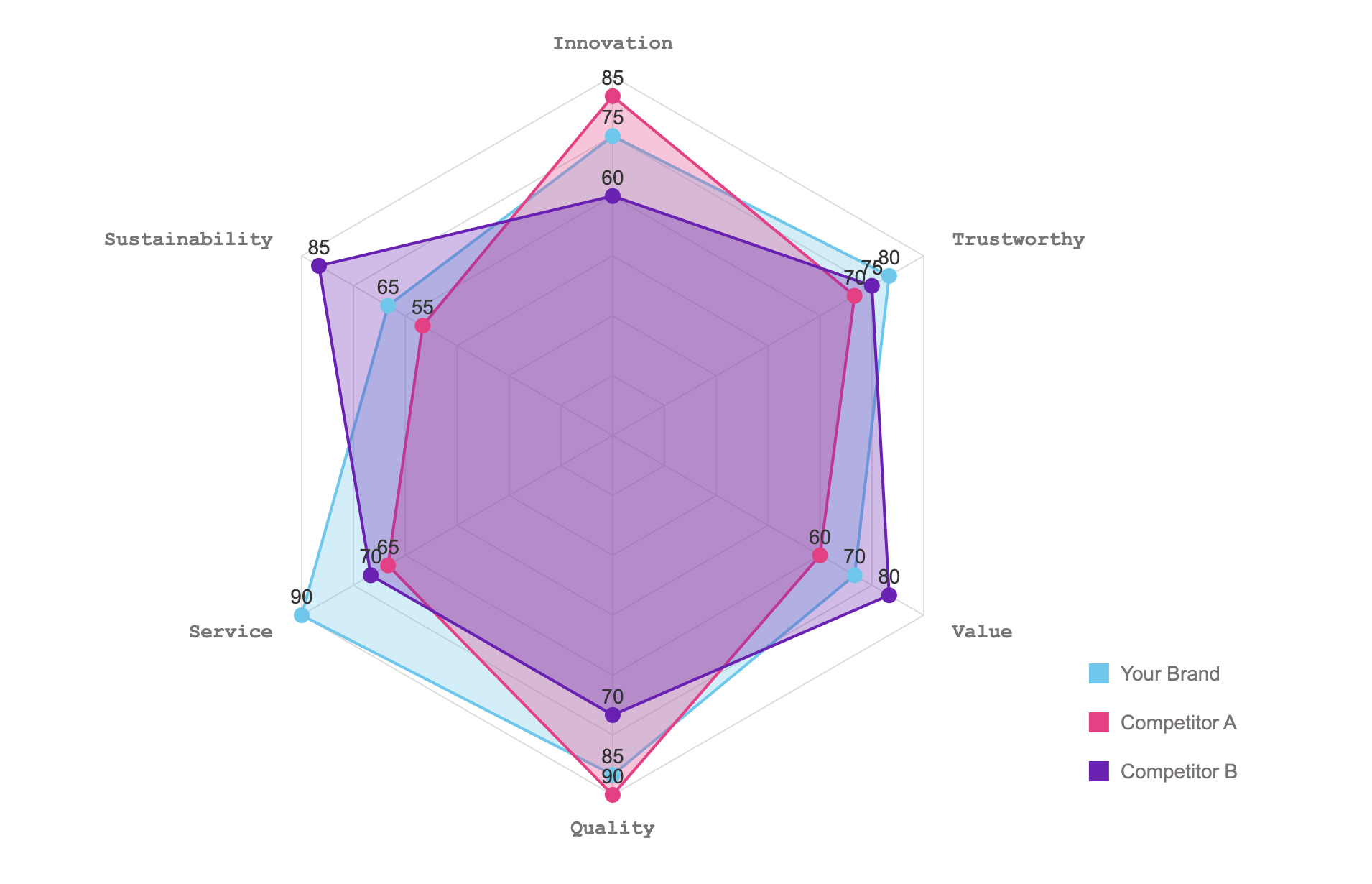
The Google Slides Problem
Try finding a radar chart in default Google Slides. You won't.
Most people end up hacking something together in Excel. Then they take a blurry screenshot and paste it onto their slide.
If the marketing data changes five minutes before the pitch? You have to start the whole messy process over again.
That's exactly why we built ExtraChart. It's a Google Slides add-on that lets you build professional visualizations without ever leaving your deck.
How to Build Your Persona Chart
Ready to ditch the bullet points? Here is how to map your audience visually, right inside your presentation.
1. Open the ExtraChart Sidebar
Go to Extensions -> ExtraChart -> Create & Edit Charts in your Google Slides menu.
Our sidebar will pop open, giving you instant access to 20 specialized chart types without opening a new browser tab.
2. Pick the Radar Chart
Scroll down to the Advanced Visualization section and click the Radar Chart icon.
A clean popup editor will appear, showing you a real-time preview of your graphic.
3. Drop in Your Persona Data
Switch over to the Data tab. It feels just like a lightweight spreadsheet.
You can score your personas (say, from 1 to 10 for each trait) directly in the cells. Already have the data in a CSV? Just copy and paste it in. You'll watch the preview update instantly as you tweak the numbers.
4. Style to Match Your Brand
Head over to the Settings tab to make it presentation-ready.
You have total granular control here. Adjust the gridlines, change the label fonts to match your corporate style, and drop in your exact brand hex codes using our color palette manager.
5. Insert and Keep It Updatable
Click "Create" and your new radar chart drops onto your active slide as a crisp, high-resolution image.
Here is the best part: ExtraChart embeds the metadata right into the image. If "Enterprise Eric" suddenly becomes more price-sensitive after a new survey, you don't need to create a new chart. Just click the image, re-open ExtraChart, and edit your data exactly where you left off.
Make Your Next Pitch Stand Out
Stop making your team read paragraphs of text to understand who they are selling to. Visualizing personas makes your marketing strategy instantly clear and highly memorable.
Give ExtraChart a try on your next presentation deck. Your audience will thank you.