How to Visualize Customer Acquisition Cost (CAC) vs. LTV in Google Slides Using a Grouped Bar Chart
March 27, 2026
You just pulled the latest marketing numbers, and you've got five minutes before the big stakeholder meeting. You know your marketing channels are finally profitable.
But throwing a massive spreadsheet at your board or leadership team? That's a fast track to glazed-over eyes.
When you need to prove that your marketing spend is actually generating long-term revenue, nothing beats comparing Customer Acquisition Cost (CAC) against Customer Lifetime Value (LTV).
The golden rule in SaaS and e-commerce is a 3:1 ratio. You want your LTV to be three times higher than your CAC. If you're paying $100 to acquire a user, they better bring in $300 over their lifetime.
But how do you clearly show that dynamic in a presentation? Let's talk about the easiest way to pull this off inside Google Slides.
Why a Grouped Bar Chart?
I've seen plenty of founders try to map CAC and LTV on complicated line graphs or messy pie charts. Don't do it.
A grouped bar chart is your best friend here.
It takes two related metrics (your cost and your value) and places them side-by-side for each category. Whether you're breaking down your data by month, by customer cohort, or by marketing channel (like Meta Ads vs. LinkedIn Ads), a grouped bar makes the gap immediately obvious.
A tall LTV bar standing right next to a short CAC bar instantly screams "profit."
The Native Google Slides Problem
If you've ever tried building a custom grouped bar chart using the default Google Slides tools, you know the headache.
You have to jump out of your presentation, open a linked Google Sheet, format the chart there, and pray the formatting doesn't break when you paste it back into your slide. Oh, and good luck trying to make the colors perfectly match your brand palette without wasting an hour.
There's a faster way.
Enter ExtraChart
We built ExtraChart specifically so you never have to leave Google Slides to make professional-grade visualizations.
It sits right in a sidebar, gives you a live preview, and inserts crisp, high-resolution charts directly onto your slides.
Here is exactly how to visualize your CAC and LTV data using a grouped bar chart in under two minutes.
1. Select the Grouped Bar Chart
Once you've installed ExtraChart from the Google Workspace Marketplace, open your slide deck.
Go to Extensions -> ExtraChart -> Create & Edit Charts.
The sidebar will pop open with 20 different chart types. Scroll down to the Bar & Column charts and click the Grouped Bar Chart icon.

2. Paste Your Data
A popup editor will appear. On the right side, you'll see the Data tab. It works just like a mini spreadsheet.
I usually organize my data like this:
- Column A: Marketing Channel (e.g., SEO, Google Ads, TikTok Ads)
- Column B: CAC
- Column C: LTV
Just copy your numbers from whatever tool you use and paste them directly into the cells. The chart preview on the left updates instantly as you type.
3. Customize to Match Your Brand
This is where your slide goes from "meh" to "wow."
Click over to the Settings tab. Here, you have total control over the chart's anatomy. I highly recommend doing a few specific things for CAC vs LTV charts:
- Color Coding: Use a "warning" color like red or orange for your CAC bars, and a "growth" color like green or blue for LTV. ExtraChart lets you punch in your exact brand hex codes to save as custom palettes.
- Clean Up the Axes: Remove unnecessary gridlines to keep the slide clean and focus entirely on the data.
- Font Consistency: Change the label fonts to match your presentation theme. ExtraChart supports gorgeous, modern fonts like Roboto and Inter.
4. Insert and Update Later
Happy with how the grouped bar chart looks? Hit "Create."
ExtraChart renders the graphic entirely on the client side (so your financial data stays completely private) and drops a high-res image right onto your active slide.
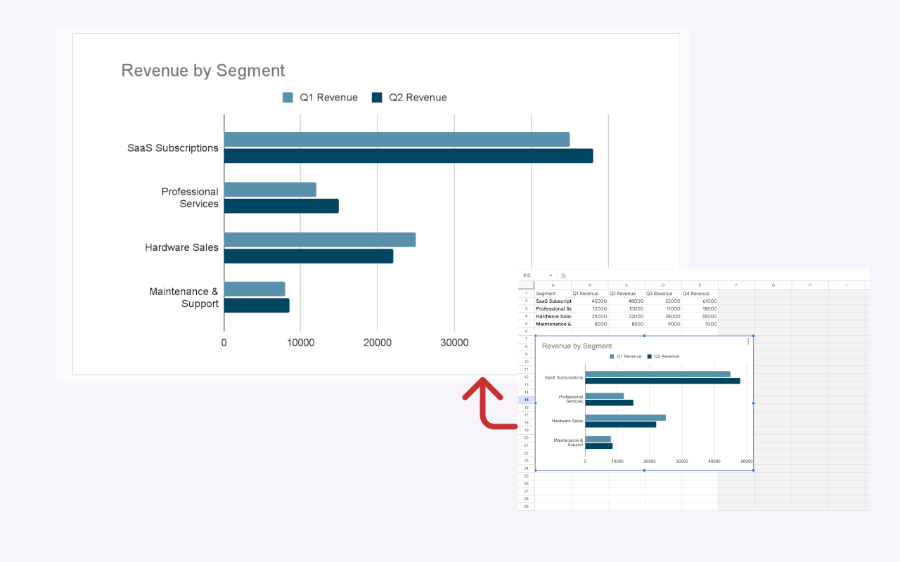
The best part? If you present this on Tuesday, and marketing hands you new numbers on Wednesday, you don't have to start over. Just click the chart on your slide, open ExtraChart, and the editor remembers all your data and settings. Just tweak the numbers and hit update.
Present Data That Makes Sense
Presenting financial metrics shouldn't be a chore. And your audience shouldn't have to squint at a spreadsheet to understand your business health.
By throwing your CAC and LTV into a grouped bar chart, the story writes itself. The data is clear, the visuals are sharp, and you look like a pro.
Ready to make your numbers look incredible without wrestling with native formatting? Add ExtraChart to Google Slides and give it a spin. Your next pitch deck will thank you.