How to Visualize Actual vs. Target Data in Google Slides (3 Pro Alternatives to Clustered Bars)
March 1, 2026
Let’s be honest: the "Clustered Bar Chart" is the default setting for almost every business presentation, and it’s usually the wrong choice.
You know the slide I’m talking about. You have a monthly sales report. You want to show what you actually sold versus what you planned to sell. So, you open Google Slides, insert a chart, and end up with two bars sitting side-by-side for every single month.
If you’re looking at Q1, that’s six bars. If you’re looking at a full year, that’s 24 colorful rectangles screaming for attention. It’s cluttered, it consumes valuable slide real estate, and worst of all, it forces your audience to do mental math to figure out the difference between the two bars.
There are better ways to tell this story.
When you need to visualize Actual vs. Target data, you need charts specifically designed for variance analysis. While native Google Slides options are limited here, using a tool like ExtraChart unlocks visualization types that professional dashboards use.
Here are three professional alternatives to the clustered bar chart that will make your data clearer and your slides cleaner.
1. The Bullet Chart (The KPI Gold Standard)
If you only take one thing away from this article, let it be the Bullet Chart.
Designed specifically to replace gauges and meters, the Bullet Chart is the ultimate space-saver. It combines three pieces of data into a single, linear bar:
- The Target: Usually a vertical line marker.
- The Actual: A narrow, central bar.
- The Qualitative Range: Background shades (like bad, satisfactory, good) that give context.
Instead of two bars side-by-side, you get one bar that instantly tells the viewer: "We are here (bar), we needed to be here (line), and we are currently in the 'good' zone (background)."
Why use it? Native Google Slides doesn't have a Bullet Chart. You usually have to hack a Stacked Bar chart and draw manual lines over it (which breaks the moment you update data). With ExtraChart, you can select the Bullet Chart from the sidebar, paste your data, and adjust the "Target Marker" settings instantly.

2. The Radar Chart (For "Gap Analysis")
Sometimes, your "Target" isn't a single revenue number. Sometimes, you are comparing a profile against a standard.
Imagine you are doing an employee skills assessment or a product comparison. You have 5-6 distinct categories (e.g., Coding, Communication, Management, Design, Sales).
- The Target: The ideal profile for a Senior Manager.
- The Actual: The current candidate's skills.
If you use a bar chart for this, you end up with 10-12 bars. It’s a mess.
A Radar Chart (or Spider Chart) is perfect here. It plots the "Target" as one shape and the "Actual" as an overlaying shape. Any gap between the two shapes immediately highlights where the deficiencies (or proficiencies) are.
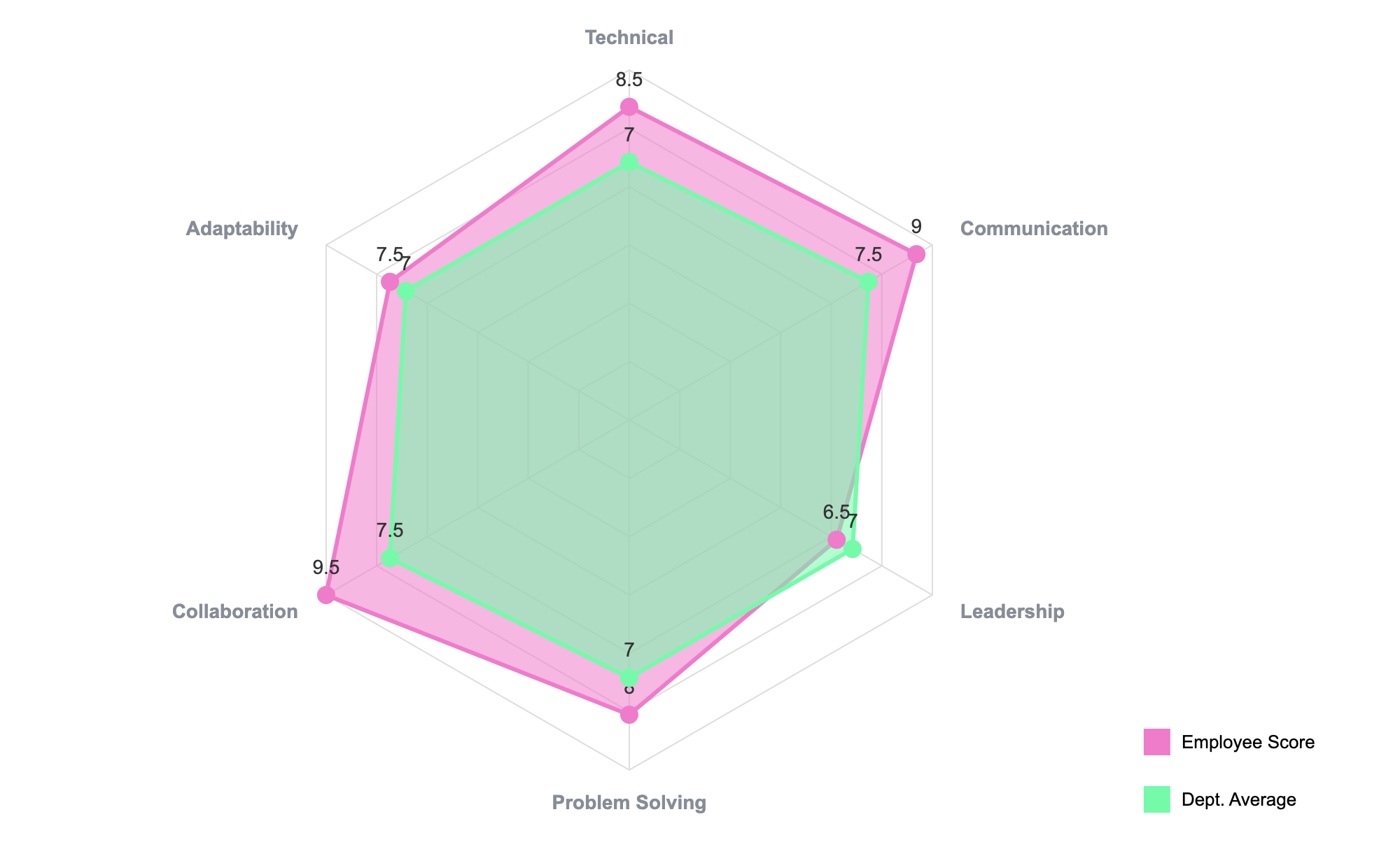
As you can see in the example above, the visual overlap makes the "gap" obvious without needing to read a single number. This is incredibly powerful for HR reviews or product feature comparisons.
3. The Funnel Chart (For Conversion Targets)
If your "Actual vs. Target" data is about a process—like sales leads converting to deals—bars are terrible at showing the flow.
You might have a target of 1,000 leads and an actual of 800. But where did you lose them?
A Funnel Chart visualizes the progressive reduction of data as it passes from one phase to another. While often used just for "Actual" numbers, pro users often overlay a second funnel (or use a ghosted outline) to show the "Target" funnel behind it.
Even used simply, a Funnel helps you spot if your "Actual" drop-off rate between stages is hitting your target efficiency benchmarks.

How to create these in Google Slides
The frustration many users face is that Google Slides' native chart engine is basic. It relies on Google Sheets integration which is great for spreadsheets, but limited for design-heavy visualizations like Bullet or Radar charts.
This is where ExtraChart fits into your workflow. It runs as a sidebar right inside your presentation, so you never have to context-switch or take screenshots of Excel.
- Open the Sidebar: Go to Extensions -> ExtraChart -> Create & Edit Charts.
- Pick Your Chart: Select "Bullet," "Radar," or "Funnel" from the menu.
- Paste Data: Copy your columns from Sheets and paste them into the ExtraChart editor.
- Visualize: The preview updates in real-time. You can tweak the target lines, colors, and fonts to match your brand exactly.
- Insert: Click create, and it places a high-res visualization on your slide.
The best part? If your actuals change next month, you don't need to rebuild the slide. Just select the chart, open the add-on, update the numbers, and you're done.
Stop letting clustered bars clutter your message. Give your data the professional look it deserves.