How to Visualize A/B Testing Results in Google Slides Using a Grouped Bar Chart
March 19, 2026
You just wrapped up a massive A/B test. The data is definitive. Variant B completely crushed the control group.
You're excited to show the marketing team. But when you drop a screenshot of your raw spreadsheet onto slide four, the room goes dead silent. Nobody knows what they're looking at.
Raw data doesn't win arguments. Clear visual stories do.
When you need to compare two distinct variations across multiple metrics—like Open Rate, Click-Through Rate, and Conversion Rate—nothing beats a grouped bar chart. It places the performance of your Control and Variant side-by-side, making the winner painfully obvious.
Here is how to build one perfectly in Google Slides.
The Problem with Native Charting
If you've ever tried building a grouped bar chart using the default Google Slides tools, you already know the headache.
Native charts force you out of your presentation and into a linked Google Sheet. Suddenly, you are wrestling with cell ranges and spreadsheet formatting instead of finishing your slide deck. Worse, if someone accidentally moves a file, your chart link breaks right before the big meeting.
You need a way to build professional visualizations without leaving your workflow.
The Solution: Build It Directly on the Slide
This is exactly why we built ExtraChart. It is an add-on that brings a dedicated, advanced chart maker directly into your Google Slides sidebar.
Everything happens locally on your slide. No forced spreadsheets. No broken links.
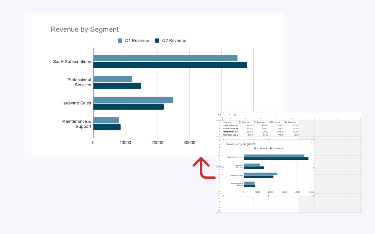
Here is the exact step-by-step workflow for visualizing your next A/B test.
Step 1: Open ExtraChart
Open your presentation and navigate to the menu. Click Extensions -> ExtraChart -> Create & Edit Charts.
The sidebar will open on the right, giving you access to 20 specialized chart types. Click the Grouped Bar Chart icon.
Step 2: Paste Your Data
A popup editor will appear with a real-time preview of your chart. Head to the Data tab.
You will see a lightweight, spreadsheet-like grid. Simply copy your A/B test data from Excel or your analytics dashboard and paste it right in.
Set up your rows as your metrics (e.g., Opens, Clicks, Purchases). Set your columns as your test groups (Control vs. Variant B). The preview updates instantly as you paste.
Step 3: Style for Maximum Impact
A great chart tells the viewer where to look. Head over to the Settings tab.
Under the color palette manager, mute your Control group by assigning it a soft gray. Then, grab your brand's primary hex code and apply it to Variant B. Now, the winning test practically jumps off the screen.
You can also adjust the bar spacing and padding to make the groupings tighter and easier to read.
Step 4: Insert and Edit Later
Click "Create." ExtraChart inserts your new grouped bar chart onto the slide as a crisp, high-resolution image.
Did your analytics team just send updated numbers? No problem. Select the image on your slide, re-open ExtraChart, and the editor will pull up your exact data and settings. Just type the new numbers and click update.
Stop Settling for Confusing Slides
Your A/B testing efforts take weeks of planning, execution, and monitoring. Don't let all that hard work fall flat in the final presentation.
By using a grouped bar chart, you let the data do the talking. And by using ExtraChart, you save yourself hours of formatting frustration.