How to Visualize a Hiring Pipeline in Google Slides (Using a Funnel Chart)
March 30, 2026
Let's be real. Presenting recruitment metrics to the executive team usually ends up as a boring bulleted list. Or worse, a massive spreadsheet crammed onto a single slide.
You need to show exactly where candidates are dropping out of your hiring process. You want to highlight that while your team sourced 500 candidates, only 50 passed the phone screen, and just 2 accepted an offer.
A funnel chart is the absolute best way to show this conversion data.
But try finding a funnel chart option in native Google Slides. Spoiler: It doesn't exist. You're left manually drawing and resizing stacking trapezoid shapes. The moment your recruiting coordinator updates the numbers, your whole slide breaks and you have to redraw it. I've been there. It's incredibly frustrating.
Here is how to build a dynamic, data-driven hiring funnel right inside your presentation—no manual shape-drawing required.
Why a Funnel Chart Works for HR
A hiring pipeline is literally a funnel. You start wide at the top with applicants and narrow down to the final hires at the bottom.
Visualizing this helps leadership instantly spot bottlenecks. If your funnel goes from 200 "Interviewed" to just 5 "Offers Extended," you immediately know where the hiring manager is getting stuck.
The Easy Way to Build It
Since Google Slides doesn't support funnel charts out of the box, we're going to use ExtraChart. It's an add-on that puts a professional chart builder right in your sidebar.
Here is how to build your hiring pipeline visualization in about two minutes.
1. Launch ExtraChart
If you haven't already, install ExtraChart from the Google Workspace Marketplace.
Open your HR presentation in Google Slides. Go to your top menu and click Extensions -> ExtraChart -> Create & Edit Charts. The sidebar will open up on the right.
2. Select the Funnel Chart
You'll see a grid of 20 different advanced chart types. Scroll down to the Business & Analytics section and click the Funnel Chart icon.

3. Drop In Your Recruitment Data
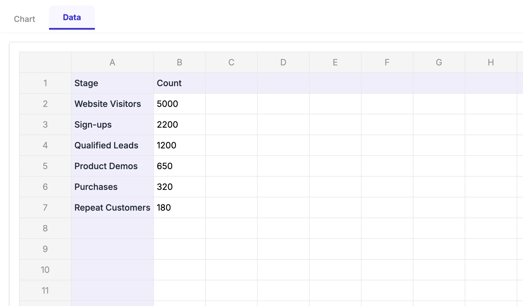
When you click the icon, a clean popup editor appears. This is where the magic happens.
Instead of messing with messy external spreadsheets, you can just paste your data directly into the Data tab. For a hiring pipeline, your rows will look something like this:
- Sourced: 850
- Phone Screen: 320
- 1st Interview: 145
- Final Interview: 40
- Offer Extended: 12
- Hired: 9
As you type or paste these numbers, the preview on the left updates instantly.
4. Style It for Your Brand
Nobody wants an ugly, generic chart in a board deck. Click over to the Settings tab in the ExtraChart editor.
Here, you have total control. You can adjust the padding, change the font to match your company's branding (like Inter or Roboto), and tweak the label sizes so they are readable from the back of the conference room.
Watch how easy it is to customize the look and feel:
You can even use the Color Palette Manager to drop in your exact brand hex codes.
5. Insert and Update Later
Once it looks perfect, click "Create." ExtraChart drops a crisp, high-resolution image of your funnel directly onto your slide.
Here is the best part: Next month, when you need to run this exact same report with new numbers, you don't have to start from scratch.
Just click the chart image on your slide and open ExtraChart again. The add-on remembers all your data and settings. Just update the numbers, click save, and your slide is instantly refreshed.
Stop fighting with shapes
Your time is better spent analyzing recruitment data, not drawing it.
By using a real funnel chart, you give your team the clarity they need to fix hiring bottlenecks. And by using ExtraChart inside Google Slides, you save yourself hours of formatting headaches.
Ready to build your first hiring funnel? Give ExtraChart a try on your next presentation.