How to Visualize 360-Degree Employee Feedback in Google Slides Using a Radar Chart
April 6, 2026
Let’s be honest. Most performance review presentations are a complete snooze fest.
You sit there looking at slide after slide of bullet points or basic bar charts. It’s nearly impossible to get a quick, accurate read on an employee’s strengths and blind spots. When you're dealing with 360-degree feedback—which pulls in data from peers, managers, and self-evaluations—a standard column chart just doesn't cut it.
You need a visual that captures the "whole person" at a single glance.
That’s exactly what a radar chart (sometimes called a spider chart) does. It plots multiple variables across a circular grid, making it incredibly easy to spot the gap between how an employee rates themselves versus how their team sees them.
But here’s the catch: making a good-looking radar chart directly inside Google Slides used to be a massive headache.
The Native Google Slides Problem
If you’ve tried building complex charts in Slides, you already know the drill.
Google’s native chart tools are pretty limited. You usually end up tabbing over to Excel, wrestling with the formatting until your eyes bleed, taking a screenshot, and pasting it into your deck.
Then, twenty minutes before your HR meeting, a manager updates their feedback score. Now you have to start the whole messy screenshot process over again.
There is a much easier way to handle this workflow without ever leaving your presentation tab.
Enter ExtraChart
For advanced visuals like this, I rely on ExtraChart, an add-on built specifically for Google Slides. It gives you 20 professional chart types, including highly customizable radar charts, directly in your sidebar.
Here is how you can use it to build a stunning 360-degree feedback visualization in about three minutes.
Step 1: Set Up Your Competencies
Before opening ExtraChart, organize your data. For a standard 360 review, pick 5 to 8 core competencies. Think things like Leadership, Technical Skills, Communication, Teamwork, and Problem Solving.
You’ll want scores (usually out of 5 or 10) for three categories:
- Self-Evaluation
- Peer Average
- Manager Score
Step 2: Open ExtraChart
Open your deck, go to Extensions -> ExtraChart -> Create & Edit Charts.
The sidebar will pop open. Scroll down to the Advanced Visualization section and click the Radar Chart icon.
Step 3: Paste Your Data
A popup editor will appear with a live preview on the left and your data sheet on the right.
This is where the magic happens. You don’t need to type everything out manually. Just copy your grid of scores straight from Google Sheets or Excel and paste it right into the ExtraChart data tab. The preview updates instantly.
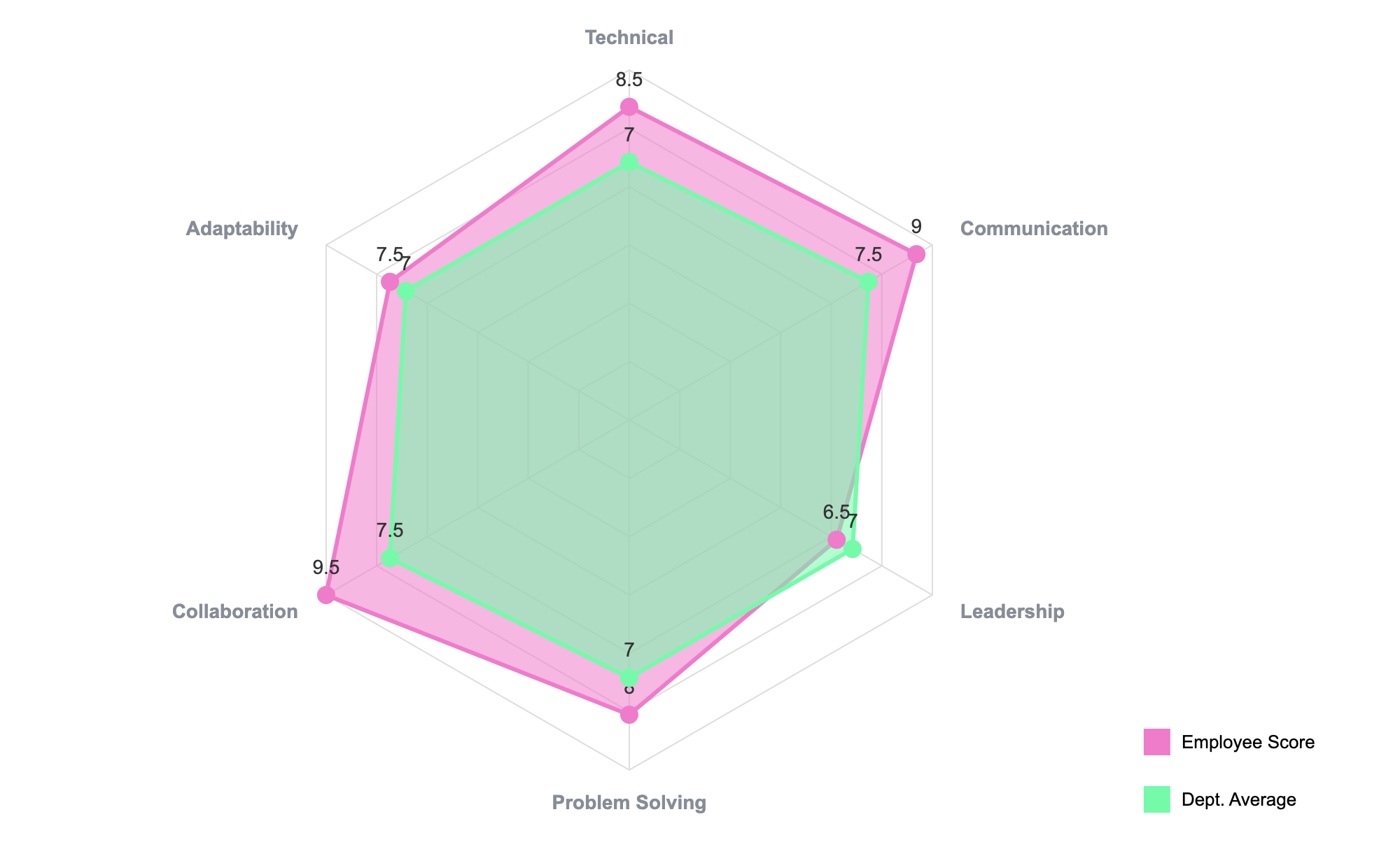
Step 4: Customize for Clarity
A radar chart with three overlapping shapes can get visually overwhelming if you aren't careful.
Switch over to the Settings tab. Here, you have total control over the chart’s typography, colors, and layout.
- Adjust Opacity: I highly recommend dropping the fill opacity on your data series so you can see where the shapes overlap.
- Color Coding: Use your brand’s color palette. Make the "Manager Score" a bold, solid line so it stands out as the benchmark.
- Legends: Move your legend to the bottom of the chart to give the radar shape maximum breathing room on your slide.
Step 5: Insert and Update
Click "Create." ExtraChart drops a crisp, high-resolution image of your radar chart right onto your active slide.
But remember that nightmare scenario where scores change at the last minute?
ExtraChart solves that completely. If a score gets updated, just click the chart image on your slide and re-open the ExtraChart extension. The app retrieves your exact settings and data. You just tweak the number, hit save, and your chart updates instantly. No re-screenshotting required.
Why This Method Wins
Presenting 360-degree feedback should be about having meaningful conversations, not deciphering messy data.
When you use a radar chart, the story writes itself. A sharp spike in "Communication" on the peer side but a low self-score? That’s imposter syndrome you can actually point to. A massive gap in "Leadership" between the manager and the employee? That’s a clear coaching opportunity.
By keeping the entire creation and editing process inside Google Slides with ExtraChart, you save time, maintain complete privacy over your HR data (since rendering happens locally), and keep your decks looking sharp and professional.
Give it a try for your next review cycle. Your management team will thank you.