How to Create a Sales Funnel Chart in Google Slides (3 Easy Methods)
January 30, 2026
Let’s be honest: Google Slides is great for a lot of things, but visualizing a sales pipeline isn't one of them.
If you’ve ever tried to make a funnel chart using the native tools, you probably ended up drawing a big upside-down triangle, slapping some text boxes over it, and calling it a day. I’ve been there. The problem is, that’s not a chart—it’s a doodle. It’s not accurate, the sections aren't proportional to your actual data, and if your numbers change next week, you have to redraw the whole thing.
Whether you're presenting quarterly earnings, analyzing lead drop-off, or pitching a new marketing strategy, you need a funnel that actually reflects reality.
Here are three ways to get it done, ranging from the "free but painful" manual method to the "one-click" professional solution.
Method 1: The "Shape Hack" (Manual Drawing)
This is the method most people use by default. It’s quick if you don't care about data accuracy, but it’s a nightmare if you need precision.
- Insert a Trapezoid: Go to
Insert>Shape>Basic Shapesand pick the Trapezoid. - Rotate and Stack: Draw one, rotate it 180 degrees so the wide part is up. Then, copy and paste it 3 or 4 times.
- Resize Manually: You have to eyeball the size of each trapezoid to make them look like they are "funneling" down.
- Add Text Boxes: You’ll need to manually overlay text boxes for labels (e.g., "Leads: 1000") and percentages.
The Verdict: It works for a rough visual concept, but please don't use this for data reporting. The moment someone asks, "Is that stage actually 50% smaller than the top one?", you'll have to admit you just guessed the size.
Method 2: The Google Sheets Workaround
If you want data accuracy without installing new tools, you can build the chart in Google Sheets and import it. However, here is the catch: Google Sheets does not have a native "Funnel Chart" button either.
To make one in Sheets, you have to use a "Stacked Bar Chart" hack:
- Open a new Sheet.
- Create three columns: Stage Name, "Spacer" (a helper column to center the bars), and Data Value.
- You have to calculate the Spacer value using a formula like
=(MaxValue - CurrentValue)/2. - Insert a Stacked Bar Chart.
- Set the "Spacer" series color to "None" (transparent).
It’s clever, but it’s tedious. And when you copy-paste that chart into Slides, the formatting often breaks, or the text becomes unreadable if you resize the image.
Method 3: The ExtraChart Way (Fast & Professional)
This is why we built ExtraChart. We realized that professionals shouldn't have to use formulas just to visualize a simple sales process.
ExtraChart runs directly inside Google Slides as a sidebar. It gives you a dedicated Funnel Chart type that is mathematically accurate and looks clean instantly.
Here is how you do it:
1. Open ExtraChart
Click on the ExtraChart icon in your sidebar. If you haven't installed it yet, you can grab it from the workspace marketplace.
2. Select "Funnel Chart"
Browse the chart types. You’ll see options for standard Funnels, but also related charts like Pyramids or Bar charts if you change your mind.
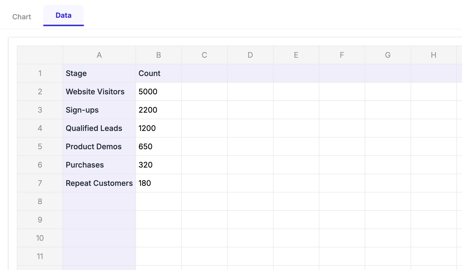
3. Input Your Data
Instead of messing with spacer formulas, just type your raw numbers into the Data tab (e.g., Leads: 1000, Prospects: 500, Sales: 100). You can also copy-paste straight from Excel. The preview updates instantly.
4. Customize the Look
This is where you can make it match your brand.
- Spacing: Add gaps between the funnel sections for a modern look.
- Colors: Use the palette manager to apply your company’s specific hex codes.
- Labels: Toggle percentages or absolute values with one click.
I made a quick video showing how easy it is to tweak the settings here:
5. Insert and Edit Later
Click "Create," and the chart appears on your slide as a high-resolution image.
The best part? Next month, when your sales numbers change, you don't have to start over. Just click the chart, open ExtraChart, and update the numbers. It remembers your colors, fonts, and settings perfectly.
Summary
If you are just sketching a concept, the Shape Hack is fine. If you love spreadsheet formulas and have time to kill, the Google Sheets method works.
But if you value your time and want a presentation that looks like it was designed by a pro, use a dedicated tool like ExtraChart. It turns a 20-minute struggle into a 2-minute task.
Ready to try it? Install ExtraChart for free and build your first funnel today.