How to Create a Quadrant Chart in Google Slides for SWOT & Matrix Analysis
February 10, 2026
We have all been there. It’s 9 PM, and you are staring at a blank Google Slide, trying to build a "Magic Quadrant" style chart for tomorrow's strategy meeting.
You know the one: four squares, an X-axis for "Market Share," and a Y-axis for "Completeness of Vision."
If you try to do this with native Google Slides tools, you are likely stuck in "shape purgatory." You draw a big square, divide it with lines, and then manually drag little circles around the page. God forbid the data changes—you have to nudge every single bubble by hand. It’s inaccurate, tedious, and frankly, it looks messy.
There is a better way to handle strategic analysis visualization. Whether you are building a SWOT analysis, a competitive matrix, or a risk assessment chart, you need a tool that binds actual data to the visual.
Here is how you can build dynamic Quadrant Charts directly inside Google Slides using ExtraChart, without ever drawing a manual text box again.
The Secret: It’s Just a Scatter Plot
A Quadrant Chart is really just a Scatter Plot dressed up for business.
- X-Axis: Represents your first variable (e.g., Cost, Risk, Market Presence).
- Y-Axis: Represents your second variable (e.g., Value, Impact, Completeness).
- Quadrants: The visual division of the chart into four zones.
Native Google Slides has a scatter plot, but it is notoriously difficult to style. You can't easily control the axis origin to center it, and customization options for the dots (bubbles) are limited.
This is where ExtraChart fits into your workflow. It allows you to generate a precise Scatter Plot (or Bubble Chart) and customize the axes and gridlines to create that perfect 2x2 matrix look.
Step-by-Step: Creating Your Matrix
1. Launch the Editor
First, forget about opening Excel. You can do this right on the slide. Go to Extensions -> ExtraChart -> Create & Edit Charts. The sidebar will open with a library of visualization types that go way beyond the standard bar and line graphs.
2. Select the Scatter Plot
In the sidebar, scroll down to the "Business & Analytics" section (or look through the icons). You want to select the Scatter Plot.

3. Input Your Strategic Data
Once the popup editor loads, switch to the Data tab. You don't need to format a complex spreadsheet. Just paste your data.
For a quadrant chart, you need three columns:
- Label: The name of the competitor, product, or risk factor.
- X-Value: The score for the horizontal axis (0-100 usually works best for matrices).
- Y-Value: The score for the vertical axis.
Pro Tip: If you want to convey a third dimension, like market size, use a Bubble Chart setup where a 4th column dictates the size of the dot.
4. Style for Impact (The Important Part)
This is where ExtraChart beats native tools. In the Settings tab, you have granular control over the look and feel.
To get that "Matrix" look:
- Axes: Set your Min and Max values explicitly (e.g., -10 to 10, or 0 to 100).
- Gridlines: distinct gridlines help visually separate the four quadrants.
- Colors: Use the Color Palette Manager to assign specific brand colors to your data points. If you are doing a SWOT analysis, maybe you want distinct colors for "Internal" vs "External" factors.
Why Not Just Use Shapes?
I often get asked, "Why can't I just drag circles onto a slide?"
You can, but you lose the integrity of the data.
When you use ExtraChart, the chart is generated from numbers. If you present this to a stakeholder and they say, "I think Competitor X has a higher market share," you don't have to guess where to move the dot. You open the ExtraChart editor, change the value from 40 to 60, and the chart updates instantly.
Plus, with the Update Feature, you can come back to this slide next quarter, select the chart, and just tweak the new numbers. No re-drawing required.
Going Beyond the Quadrant
While the 2x2 matrix is a classic, sometimes a simple X/Y plot isn't enough to show the full picture.
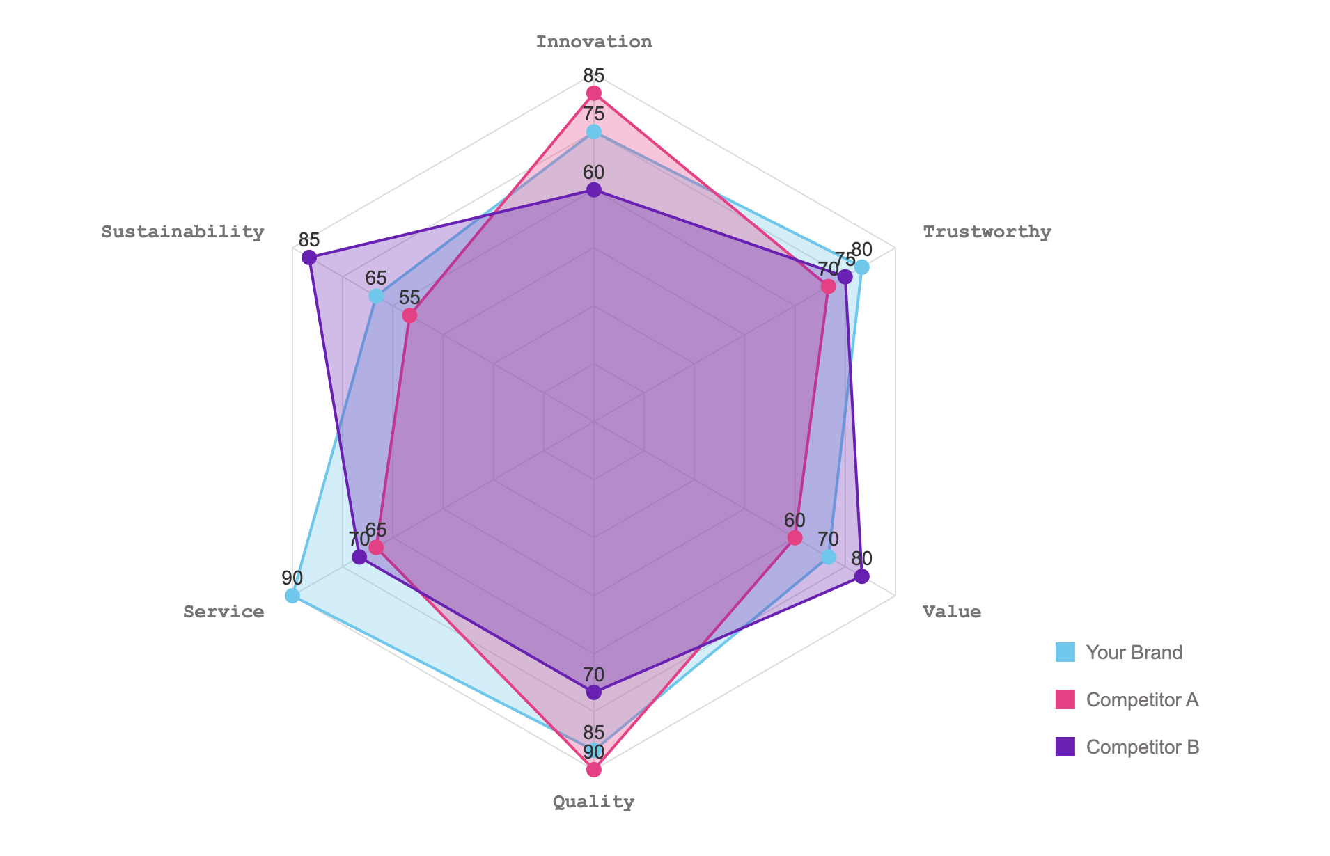
If you are analyzing multiple dimensions—say, comparing a product across Price, Speed, Durability, support, and Design—a Quadrant chart fails. You can't fit 5 dimensions on 2 axes.
For those scenarios, I recommend switching to a Radar Chart (also available in ExtraChart). It’s perfect for gap analysis or skills assessments where you need to visualize strengths across several categories simultaneously.
Summary
Don't let the limitations of Google Slides dictate the quality of your analysis. Whether it's a Quadrant Chart for positioning or a Radar Chart for capability gaps, using a dedicated tool like ExtraChart ensures your presentation looks professional and remains accurate.
Stop drawing lines. Start plotting data.