How to Create a Population Pyramid in Google Slides for Demographic Analysis
February 27, 2026
If you have ever tried to build a population pyramid in Google Slides using the native tools, you know the pain. You usually end up creating two separate bar charts, trying to manually align them pixel-by-pixel, and praying that the axis scales don't break when you resize the slide.
It’s messy, and frankly, it usually looks like a mistake.
Demographic analysis requires precision. Whether you are visualizing an aging workforce, a target market distribution, or census data, the Population Pyramid (or age-sex structure) is the gold standard. It tells a story about growth, stability, or decline that a simple column chart just can't convey.
Today, I’m going to show you how to create one properly in Google Slides without the headache, using ExtraChart.
The "Hidden" Chart Type
Here is the thing: most people look for a button labeled "Population Pyramid." In most presentation software, it doesn't exist.
A population pyramid is technically a Bi-Directional Bar Chart. It’s two horizontal bar charts sharing a central vertical axis.
While Google Slides' native charts make this formatting nearly impossible (good luck getting those axis labels centered), ExtraChart’s Horizontal Bar Chart combined with its granular settings makes this achievable and, more importantly, professional-looking.
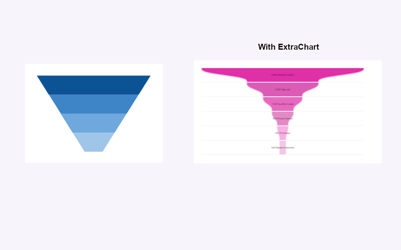
Funnel vs. Pyramid: Don't Mix Them Up
Before we build it, take a look at the image above. I often see people mistakenly using a Funnel Chart when they mean to show demographics.
- Funnel Charts (on the left) are for sequential stages. Think sales pipelines: Leads -> Opportunities -> Closed Deals. The size decreases as you filter down.
- Population Pyramids (on the right) are for comparing two distinct groups (usually Male/Female) across the same categories (Age Groups).
If you use a funnel for demographics, you lose the ability to compare the gender balance within each age bracket. Make sure you are building the right visualization for your data.
Step-by-Step: Building the Pyramid
Since we don't have a magic "Pyramid" button, we are going to use the Horizontal Bar Chart in ExtraChart to construct this view. The sidebar workflow makes this much faster than the native method because you can edit data and settings without leaving your slide.
1. Launch ExtraChart
Open your Google Slides presentation. Go to Extensions -> ExtraChart -> Create & Edit Charts. The sidebar will open on the right.
2. Select the Horizontal Bar Chart
Scroll through the 20 chart types and select the Horizontal Bar Chart. This gives us the foundation we need—bars extending sideways.
3. The Data Strategy
This is the "pro tip" moment. To get that butterfly shape where bars extend left and right from the center, you have two options depending on how you want to present the data.
Option A: The Negative Value Trick This is the fastest way to simulate a pyramid on a single chart.
- In the ExtraChart Data Tab, list your Age Groups (0-4, 5-9, etc.) in the category column.
- Create two series columns: "Male" and "Female".
- Key Step: Enter your "Male" data as negative numbers (e.g., -5000) and "Female" data as positive numbers (e.g., 5000).
- The chart will automatically render the bars extending in opposite directions from the zero line.
Option B: The Side-by-Side Method (Recommended for Cleanliness) Because ExtraChart allows for precise margin and padding controls, I often prefer creating two separate charts for a cleaner look, especially if I want to avoid negative signs appearing on the axis labels.
- Create one Horizontal Bar chart for "Male" data. In the Settings Tab, set the chart to align to the Right.
- Create a second Horizontal Bar chart for "Female" data. Align it to the Left.
- Place them side-by-side on your slide.
- Because ExtraChart renders these as high-resolution images, they won't shift or jump around like native charts do when you present.
4. Refining the Look
Once your data is in, switch to the Settings Tab. This is where ExtraChart shines over native tools.
- Gridlines: Turn off vertical gridlines to reduce clutter.
- Legends: Move the legend to the Top or Bottom so it doesn't squeeze the width of your pyramid.
- Colors: Use the Color Palette Manager. Pick distinct but complementary colors (e.g., a dark navy for one side and a teal or muted coral for the other). Avoid the stereotypical bright blue/pink unless it fits your brand strictly.
Why This Matters for Analysis
When you successfully visualize this data, you spot trends instantly. A "top-heavy" pyramid indicates an aging population (retirement planning needed). A wide base indicates a growing population (infrastructure/education needed).
By using ExtraChart, you stop fighting with the tool and start focusing on the insight. You can update the data next quarter just by clicking the chart and re-opening the sidebar—no need to rebuild the pyramid from scratch.
Ready to build better demographic slides? Install ExtraChart from the Google Workspace Marketplace and try the Horizontal Bar chart today.