How to Create a Gap Analysis Chart in Google Slides (Using Radar & Dumbbell Visuals)
March 8, 2026
You know the moment. You're building a slide deck to show management where the team is right now versus where they need to be by Q4.
You pull up a standard Google Slides bar chart. You put the "Current" bar next to the "Target" bar. It looks... fine. But it’s lazy. It forces your audience to do mental math. They have to look at the blue bar, look at the red bar, subtract the difference in their head, and then understand the gap.
A great data visualization does that math for them.
If you are conducting a Gap Analysis—whether for skills assessments, product features, or revenue targets—you need visuals that explicitly highlight the deficit. Two of the best tools for this are the Radar Chart (for multi-category data) and linear gap visuals like Bullet or Dumbbell concepts.
Here is how to build them in Google Slides without tearing your hair out.
Why Native Google Slides Charts Fail at Gaps
If you try to make a Radar chart in native Google Slides, you’ll quickly hit a wall. You have to open a linked Google Sheet, wrestle with limited formatting, and usually, the "spider web" ends up looking like a tangled mess where you can't control the transparency of the layers.
This is where having a dedicated chart engine inside Slides changes the game. I use ExtraChart because it lets me render these complex shapes directly on the slide, and crucially, it lets me control fill opacity—which is the secret sauce for gap analysis.
Method 1: The Radar Chart (For Multi-Dimensional Gaps)
Radar charts (or Spider charts) are perfect when you are analyzing gaps across multiple categories simultaneously—like a skills matrix or a brand perception audit.
The goal is to overlay two shapes:
- The Current State (Inner shape)
- The Goal State (Outer shape)
The visible space between these two shapes is your "Gap."
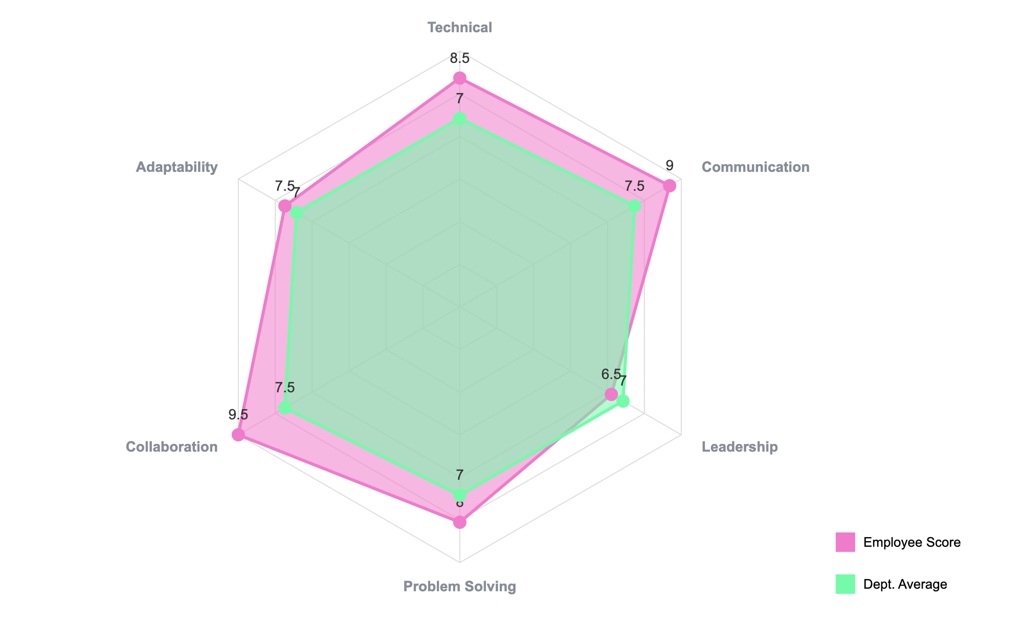
How to build this step-by-step:
- Open ExtraChart: Go to
Extensions>ExtraChart>Create & Edit Charts. - Select Radar Chart: It’s in the "Advanced Visualization" category.
- Input Your Data: In the data editor, you need three columns.
- Column A: Categories (e.g., Coding, Design, Management).
- Column B: Current Score (e.g., 3, 4, 2).
- Column C: Target Score (e.g., 5, 5, 5).
- The Vital Tweak: Go to the Settings tab. You must lower the opacity of your fill colors. If the colors are 100% solid, the top layer will hide the bottom layer. Set them to about 30-40% transparency. This creates a third color where they overlap, highlighting the "achieved" area and leaving the "gap" distinct.
This visual is powerful because it shows the shape of the deficiency. Is the team well-rounded but shrinking? Or are they spiking in one area and lagging in another? A bar chart hides this; a Radar chart screams it.
Method 2: The Linear Approach (Bullet & Scatter Visuals)
Not every gap analysis is a circle. Sometimes you just have a list of KPIs and you need to show Actual vs. Target.
In the data viz world, the "Dumbbell Chart" (a line connecting two dots) is a favorite for this. While Google Slides doesn't have a native "Dumbbell" button, you can achieve a professional gap analysis using the Bullet Chart or a modified Scatter Plot in ExtraChart.
The Bullet Chart Strategy
The Bullet Chart was literally invented to replace dashboards full of speedometers and gauges. It is the gold standard for linear gap analysis.
- Select Bullet Chart from the ExtraChart sidebar.
- Your data input will define the "Performance Measure" (the bar) against a "Comparative Measure" (the target marker).
- The chart automatically renders a background scale (Qualitative Range) that indicates bad, satisfactory, and good zones.
This is often superior to a dumbbell chart for executive presentations because it adds context. It doesn't just show the gap; it shows if the gap is in the "danger zone" or the "safe zone."
Why This Matters
When you present a gap analysis, you aren't just presenting numbers; you are asking for resources. You are saying, "Here is the hole in our plan, and I need budget to fill it."
Using the right visual—like a semi-transparent Radar chart—makes that hole impossible to ignore. It turns a spreadsheet of complaints into a visual story of opportunity.
Ready to fix your charts? You can grab ExtraChart from the Google Workspace Marketplace and try the Radar chart on your next slide.