How to Create a Dumbbell Chart in Google Slides to Visualize Variances (A Cleaner Alternative to Grouped Bars)
February 22, 2026
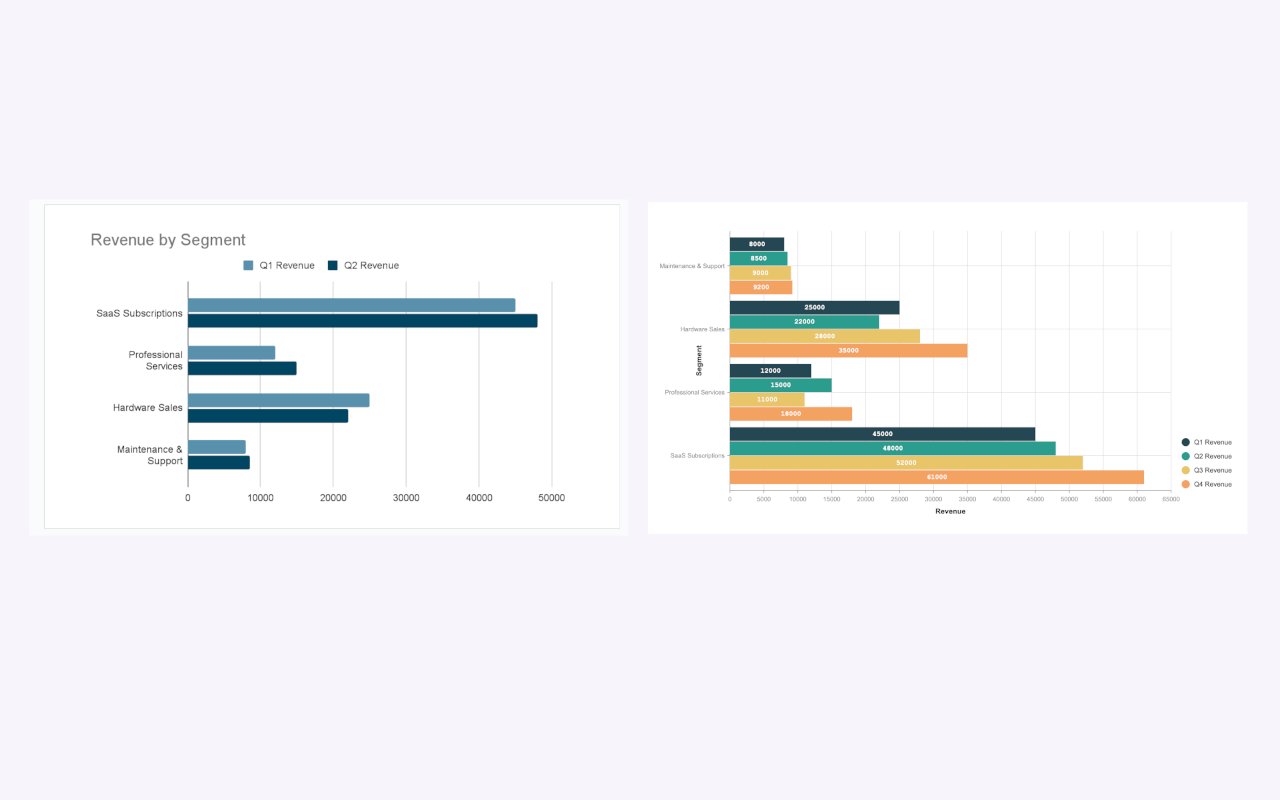
Let’s be honest: grouped bar charts are the "Reply All" of data visualization. They get the job done, but they’re often messy, crowded, and annoying to look at.
When you are trying to compare two data points—like Sales in 2024 vs. 2025, or Budget vs. Actuals—putting two bars side-by-side for every single category creates visual clutter. Your audience spends more time trying to decode the legend than understanding the story.
Enter the Dumbbell Chart (also known as the DNA chart or Barbell chart).
It’s cleaner, sharper, and highlights the gap (variance) between two numbers instantly. But there is one problem: Google Slides doesn't have a "Dumbbell Chart" button. It’s strictly a vanilla chart ecosystem.
If you want this advanced look, you have two choices: build it manually using shapes (the "hacky" way) or use a dedicated tool to generate cleaner, professional variance charts.
Here is how to do both.
Why Ditch the Grouped Bar?
Before we start building, look at the difference in clarity. Grouped bars force the eye to jump back and forth between colors. A dumbbell chart uses a single line to connect two dots, turning the "gap" into the main character of the story.
Method 1: The "Shape Hack" (Native Google Slides)
If you have five minutes and only a few data points, you can "fake" a dumbbell chart using the drawing tools in Google Slides. It’s not data-driven (meaning if your numbers change, you have to redraw it), but it works for simple slides.
- Draw your Axis: Use the Line tool to draw a horizontal line at the bottom of your slide. Add text boxes for your scale (0, 10, 20, etc.).
- Create the "Bell": Go to Shape > Shapes > Oval. Hold
Shiftand draw a small perfect circle. Copy and paste it so you have two. - Color Code: Make one circle grey (e.g., "Last Year") and the other circle a bright color like blue (e.g., "This Year").
- Connect them: Use the Line tool to draw a straight line connecting the centers of the two circles. Increase the line thickness (weight) to 2px or 3px so it’s visible.
- Group and Repeat: Select the two circles and the connecting line, right-click, and select Group. Now, copy and paste this "dumbbell" for each category you have.
The downside? It’s painful. If your boss says, "Actually, Q3 sales were 15%, not 20%," you have to manually nudge circles and stretch lines. It’s not scalable.
Method 2: The Data-Driven Way (Using ExtraChart)
If you are dealing with real data that changes, or you need to visualize variances for a professional report, drawing shapes is a nightmare.
This is where I use ExtraChart. It’s a Google Slides add-on that lets you build advanced charts without leaving your presentation. While standard Slides is missing these specialized views, ExtraChart brings 20+ types directly into your sidebar.
For Variance: The Bullet Chart
While a Dumbbell chart is great, the Bullet Chart is often the superior choice for tracking "Target vs. Actual" variances—and ExtraChart creates them instantly.
- Open your slide.
- Go to Extensions -> ExtraChart -> Create & Edit Charts.
- In the sidebar, select the Bullet Chart icon.
- Paste your data from Excel or Sheets directly into the editor.
The Bullet Chart keeps the same "cleaner than a bar chart" aesthetic but adds context ranges (like "Poor," "Average," "Good") behind the data bar. It tells a deeper story about performance in the same amount of space.
For Correlation: The Scatter Plot
If you are dead-set on the "dot" aesthetic of a dumbbell chart, you can often approximate it using ExtraChart's Scatter Plot. By plotting your categories on one axis and values on the other, you get that clean, dot-based distribution that removes the heavy visual weight of bars.
Why workflow matters
The biggest friction in Google Slides is the constant context switching. Usually, you have to generate a complex chart in Excel, take a screenshot, paste it, and then repeat the process when data updates.
With ExtraChart, the chart lives on the slide as a high-resolution image, but it retains its data metadata. Next month, you just select the chart, open the sidebar, update the numbers, and hit "Update."
Whether you hack it with shapes or use a pro tool like ExtraChart, the goal is the same: stop using grouped bars for everything. Your audience’s eyes will thank you.