How to Create a Dual-Axis Combo Chart in Google Slides (Combining Bars and Lines)
February 21, 2026
We’ve all been there. You have a slide deck due in an hour. You need to show Revenue (in millions of dollars) and Profit Margin (in percentages) on the same slide.
If you plot them on a standard bar chart, you get a row of giant bars representing the millions, and your percentage data is basically invisible—a flat line hugging the bottom of the axis because 25% (0.25) is microscopically small compared to $5,000,000.
The solution is the Dual-Axis Combo Chart. It combines a bar chart (for the volume) and a line chart (for the rate) on two separate vertical axes.
While Google Slides has native tools for this, they are notoriously clunky. Today, I’m going to walk you through why this chart type is essential and the most efficient way to build one that doesn't break every time you update the data.
Why the "Combo" is King
The combo chart isn't just about saving space. It’s about context.
If I show you a bar chart of rising revenue, you might think, "Great, business is booming!" But if I overlay a line chart showing a plummeting profit margin on the same timeline, the story changes instantly. The combo chart forces the audience to see the relationship between two distinct metrics.
Common use cases include:
- Sales vs. Margin: Total sales (Bars, Left Axis) vs. Gross Margin % (Line, Right Axis).
- Weather: Precipitation (Bars) vs. Temperature (Line).
- Marketing: Total Traffic (Bars) vs. Conversion Rate (Line).
The Native Google Slides Method (And Why It Hurts)
You can build these natively, but it requires a lot of right-clicking.
- Insert a standard chart.
- Right-click a specific data series (good luck clicking the tiny one at the bottom).
- Select "Change Series Chart Type" to turn one set of bars into a line.
- Right-click again to find "Format Data Series" and change the "Axis" from Left to Right.
The problem? It’s fragile. If you paste new data from a spreadsheet, Google Slides often resets your formatting, forcing you to rebuild the axes from scratch. Plus, the styling options are limited.
A Better Way: Using ExtraChart
For professional presentations, I prefer using ExtraChart. It’s a Google Slides add-on that acts like a dedicated chart engine inside your sidebar. It separates the data from the styling, so you can update numbers without destroying your design.
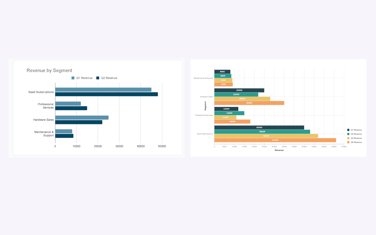
Here is a workflow that actually makes sense for busy professionals.
1. Launch the Editor
Instead of fighting with floating menus, you open the sidebar. Go to Extensions -> ExtraChart -> Create & Edit Charts.

2. Choose Your Base
The sidebar presents you with over 20 specialized chart types. For a combo chart, you usually start with a Bar or Column chart foundation. This allows you to set the primary visual weight of the graphic.

3. Customize the Series
Once the editor pops up, you have a clean, split-screen view.
- Left Side: Real-time preview.
- Right Side: Data and Settings.
This is where ExtraChart shines. In the Settings tab, you have granular control over your axes. You can assign specific data series to a secondary axis and change their visualization type (e.g., turning the "Margin" column into a line) without right-clicking invisible elements on the canvas.
You also get control over things native Slides often ignores, like:
- Padding and Spacing: Adjusting the gap between bars so the chart breathes.
- Typography: Using your specific brand fonts (Roboto, Inter, etc.) for axis labels.
- Legends: Moving them out of the way to maximize plot area.
4. Insert and Update
When you click "Create," the chart drops onto your slide as a high-resolution image.
Here is the best part: Next month, when the new numbers come in, you don't delete the slide. You just click the chart, open ExtraChart, paste the new CSV data into the editor, and hit update. The dual-axis structure stays perfectly intact.
Visual Polish Matters
When using two axes, clarity is critical. If your audience has to guess which axis applies to the bars and which applies to the line, you've lost them.
A pro tip using ExtraChart’s Color Palette Manager: Color code your axis labels to match the data. If your Revenue bars are blue, make the Left Axis text blue. If your Margin line is red, make the Right Axis text red. It’s a subtle cue that makes the chart instantly readable.

Summary
Don't let the limitations of native Google Slides charts force you into showing two separate, disconnected charts. A dual-axis combo chart tells a richer story. By using a tool like ExtraChart, you gain the control needed to handle different scales elegantly, keeping your presentation looking sharp and your data easy to digest.