How to Create a Competitor Analysis Radar Chart in Google Slides (That Actually Looks Good)
March 13, 2026
Let's be honest. Most competitor analysis slides are completely forgettable.
You’ve probably seen them. A massive, text-heavy table with green checkmarks and red crosses. Or maybe a generic grouped bar chart that tries to cram six different metrics into one confusing visual. It puts your audience to sleep before you even finish explaining your competitive advantage.
When you need to compare multiple products or brands across several distinct categories—like price, durability, features, customer support, and ease of use—the absolute best visualization is a radar chart (often called a spider chart).
The bad news? Google Slides doesn't actually have a native radar chart tool.
The good news? You don't have to build one out of overlapping triangles and lines. You can generate a publication-quality radar chart directly inside your presentation using ExtraChart.
Here is exactly how to do it.
Why Radar Charts Win for Competitor Analysis
A radar chart plots multiple variables on axes starting from a central point. When you map two or three competitors onto these axes, you instantly create a shape that shows exactly where each brand dominates and where they fall flat.
Look at this example comparing two laptops:
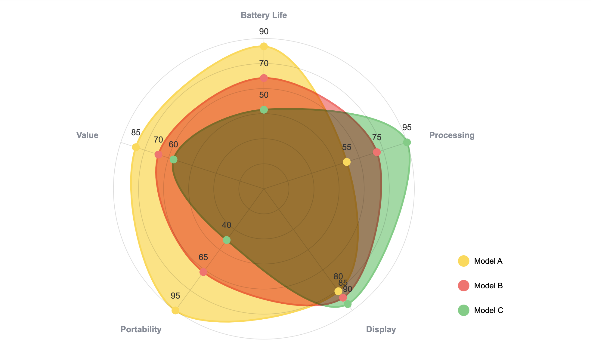
In five seconds, your audience understands the entire market layout. Brand A crushes it in battery life and portability. Brand B is a heavy, power-hungry machine meant for performance.
You don't need a wall of text to explain that. The shape tells the story.
Step 1: Open ExtraChart in Google Slides
Since native Google Slides leaves us hanging here, we'll use ExtraChart. It’s an add-on built specifically for professionals who need advanced charts without constantly switching between external design tools.
If you don't have it yet, grab it from the Google Workspace Marketplace.
Once installed, simply open your presentation and go to Extensions -> ExtraChart -> Create & Edit Charts.
The sidebar will slide open, giving you access to 20 different advanced chart types. Scroll down to the Advanced Visualization section and click the Radar Chart icon.

Step 2: Drop In Your Competitor Data
Clicking the icon opens the ExtraChart popup editor. This is where the magic happens. On the left side, you'll see a real-time preview of your chart. On the right, you have your tools.
Click over to the Data tab.
You’ll see a clean, spreadsheet-like interface. You don't need to manually type everything out if you already have it saved elsewhere. Just copy your competitor data straight from Excel, Google Sheets, or a CSV, and paste it right into the cells.

As you paste or type, watch the preview on the left. The chart updates instantly. No blind guessing, no hitting "refresh" over and over.
Pro tip: Keep your scales consistent. If you are ranking features on a scale of 1-10, make sure price is also represented as a 1-10 score (e.g., 10 being the most affordable).
Step 3: Make It Look Professional
A chart is only as good as its design. Out of the box, standard charts usually look a bit... rigid. We want this to look like it belongs in a high-end consulting deck.
Switch over to the Settings tab. Here is where you turn a basic spider web into a compelling visual.
Here are three tweaks I always make for competitor radar charts:
- Adjust the Opacity: Solid shapes block the data behind them. Lower the fill opacity to around 30-40% so the audience can see where the competitor shapes overlap.
- Match Your Brand Colors: Use the Color Palette Manager to apply your exact brand hex codes. Make your company pop with a bright, primary brand color, and fade the competitors into muted grays or secondary tones.
- Clean Up the Typography: Ditch the default fonts. Set your labels to Inter or Roboto, tweak the sizing, and give the chart breathing room by adjusting the outer padding.
Step 4: Insert and Update Whenever Needed
Once your chart looks perfect, hit the Create button.
ExtraChart immediately renders your design as a high-resolution, crystal-clear image and drops it right onto your active slide.
But here is my favorite part, and why I stopped using static screenshot tools.
Let's say next month, your competitor drops their pricing or releases a major feature update. Your competitor analysis is suddenly out of date. With a standard image, you’d have to start from scratch.
With ExtraChart, you just click the chart image on your slide, open the add-on, and hit edit. The add-on remembers all your data and settings. Just tweak the one number that changed, update the chart, and you are ready for your next meeting.
Stop Settling for Bad Slides
Competitor analysis shouldn't look like an eye exam.
By using a radar chart, you give your audience a visual shortcut to understanding your market position. And by using ExtraChart, you can build them faster, make them look significantly better, and keep them updated without ever leaving Google Slides.
Give it a try on your next pitch deck. Your audience will thank you.