How to Build a D&I Dashboard in Google Slides (That Actually Drives Change)
June 20, 2026
Let’s be honest. That D&I report you spent weeks compiling? It landed in everyone's inbox, got a few polite nods, and then vanished.
It’s a dense PDF, packed with tables and percentages. It’s accurate. It’s thorough. But it doesn’t move anyone. The numbers are just numbers; they don't tell a story. And because of that, nothing really changes.
What if you could transform that static data into a living, breathing dashboard right inside your team’s most-used tool, Google Slides? A dashboard that makes the data impossible to ignore and sparks the right conversations.
You can. And you don't need a clunky, expensive BI tool to do it.
Why a Dashboard Beats a Document Every Time
A report informs. A dashboard drives action.
When you visualize your Diversity & Inclusion metrics, you’re not just presenting data; you’re revealing patterns. You’re showing where the real gaps are, where progress is being made, and where the conversation needs to happen right now.
- Clarity: A well-designed chart is understood in seconds. A table of data requires minutes of study.
- Accountability: When progress (or lack thereof) is visualized on a slide that everyone sees, it creates shared ownership.
- Storytelling: You can finally connect the dots between hiring, promotion, pay equity, and belonging in a single, cohesive narrative.
The problem? Google Slides’ native charts are basic. They can show you the “what,” but they often struggle to show the “why.”
The Key Metrics for a D&I Dashboard That Matters
A great D&I dashboard doesn’t track everything. It tracks the right things. Here are a few core metrics and the best ways to visualize them—especially when you need to go beyond the default chart options.
1. Representation: Who is in the room?
This is the foundation. You need a clear picture of workforce demographics across departments, seniority levels, and locations.
Best Chart: A Stacked Bar Chart is perfect for this. It shows the whole (100% of a department) while also breaking down the composition (e.g., gender, ethnicity).
2. Pay Equity: Are we fair?
Showing average salaries is misleading. To truly understand pay equity, you need to see the distribution and identify outliers.
Best Chart: A Box Plot. This is something you simply can’t build with native Google Slides charts. A box plot visualizes the median salary, the range, and any outliers for different demographic groups, making pay gaps instantly obvious.
3. Inclusion & Belonging: How does it feel to work here?
This is where survey data comes in. Are employees from underrepresented groups feeling the same sense of belonging as the majority?
Best Chart: A Radar Chart (or Spider Chart). This is my absolute favorite for comparing multiple qualitative metrics across different groups or departments. You can map out scores for things like "Psychological Safety," "Voice is Heard," and "Career Growth Opportunities" all on one chart. It immediately shows where a team is strong and where the culture needs work.
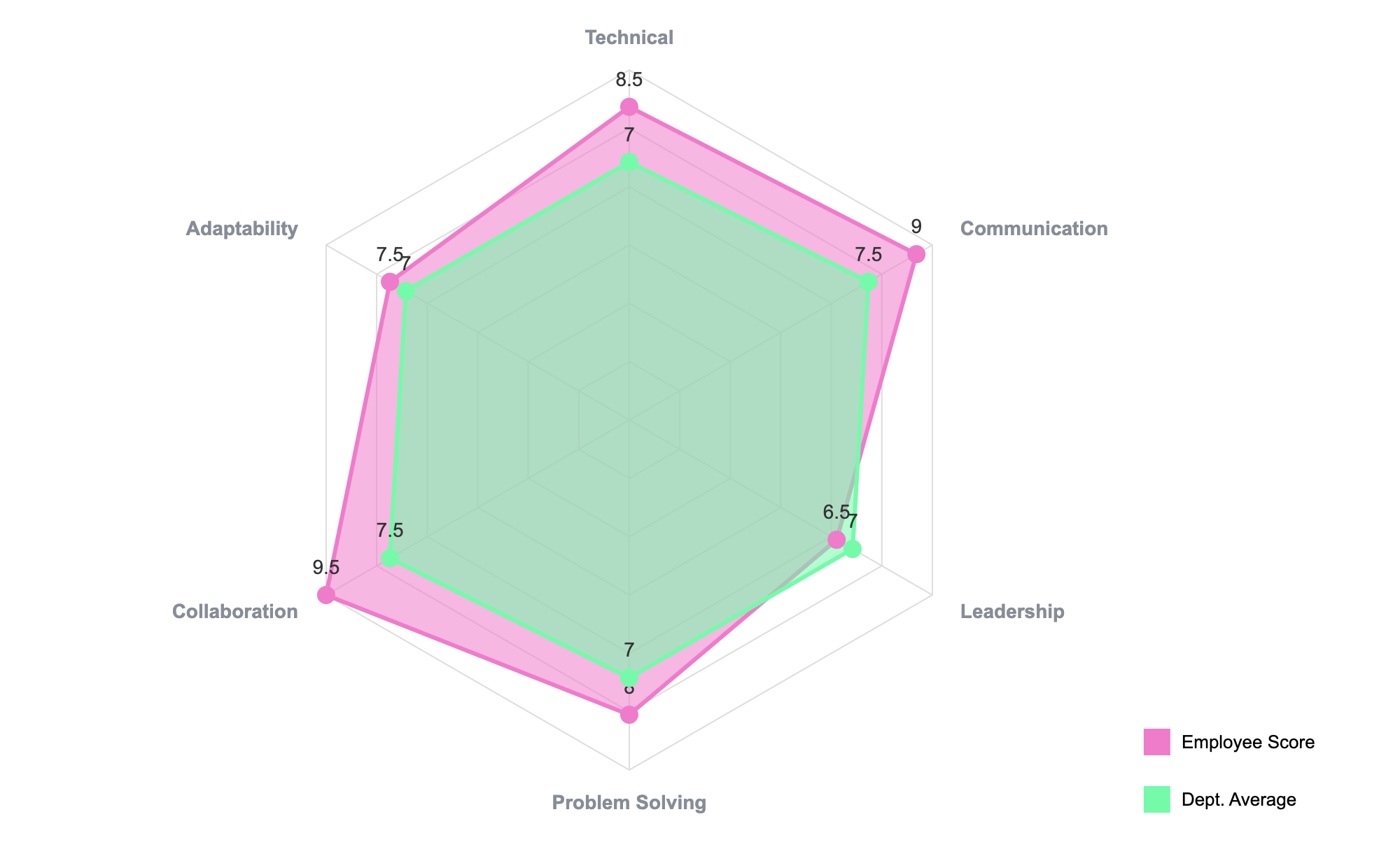
This kind of multi-dimensional view is exactly what you need to move beyond simple headcount.
Build Your First D&I Chart with ExtraChart
Let’s build that Radar Chart right now. We'll assume you have some belonging survey data in a Google Sheet, with scores for different departments.
-
Get ExtraChart: If you haven’t already, install ExtraChart from the Google Workspace Marketplace. It’s free to get started.
-
Launch the Add-on: In Google Slides, go to Extensions -> ExtraChart -> Create & Edit Charts. A sidebar with 20 advanced chart types will pop up.
-
Select the Radar Chart: Find the Radar Chart icon and click it. This opens the main editor.
-
Paste Your Data: The editor has a simple, spreadsheet-like interface. Just copy your data from Google Sheets (e.g., Departments in the first column, survey topics in the first row) and paste it directly into the
Datatab. The chart preview will update instantly. -
Customize for Clarity: Jump over to the
Settingstab. Here you can tweak everything. I recommend:- Colors: Use your brand’s color palette to keep it professional.
- Labels: Make sure the font is clean and readable.
- Legend: Position the legend where it’s easiest to read (top or right usually works well).
-
Insert Your Chart: Click "Create," and a beautiful, high-resolution chart is placed on your slide. It’s no longer just data; it’s an insight.
The Secret to a Dashboard That Lasts: Updatability
Here’s the best part. A dashboard isn’t a one-and-done project. It needs to be updated every month or quarter.
This is where ExtraChart really shines.
You don't need to rebuild your chart from scratch every time new data comes in. Just click the chart image on your slide and open the ExtraChart add-on. It automatically loads all your original data and settings. Paste in the new numbers, click "Update," and your chart is refreshed.
This one feature turns your Google Slides presentation from a static report into a dynamic, easy-to-maintain D&I dashboard.
Stop letting your data hide in PDFs. Start visualizing it where it can make a real difference.