From Red to Green: Build a Customer Success Dashboard in Google Slides to Crush Churn
June 29, 2026
You’ve been there. The dreaded email lands in your inbox on a Monday morning: "We've decided to go in a different direction."
Another customer churns. It feels like it came out of nowhere.
The truth is, it probably didn't. The warning signs were there, but they were buried across a dozen different platforms—your CRM, your support desk, your product analytics. By the time you piece it all together, it's too late.
Reactive customer success is a losing game. Proactive success, where you spot the "red" flags and intervene before they become problems, is how you win. The secret? A clear, visual, and living customer health dashboard. And you don't need a complex BI tool to build one. You can do it right where you already build your reports: Google Slides.
Why Build a Dashboard in Google Slides?
Because that's where the conversations happen.
Quarterly Business Reviews (QBRs), internal strategy meetings, executive summaries—they all live in slide decks. When your dashboard is in the same place as your presentation, you eliminate friction. No more exporting static images from one tool and pasting them into another.
The problem? Google Slides’ built-in charts are… basic. You can’t create a nuanced, multi-dimensional view of customer health with a simple bar or pie chart. You need something more powerful.
Introducing the Customer Health Radar Chart
This is where you get a true 360-degree view of an account. A radar chart (or spider chart) is perfect for plotting multiple variables for a single subject. Instead of tracking one vague "health score," you can visualize the specific pillars of that customer's success.
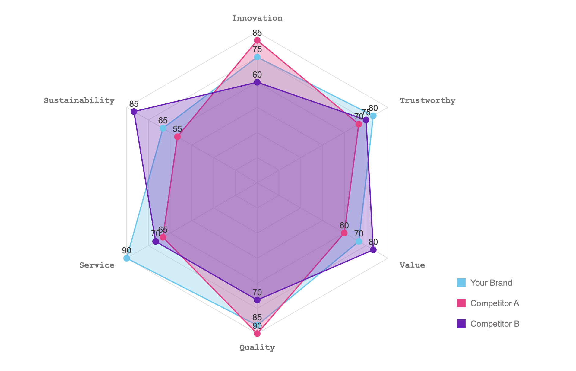
Imagine tracking a key account across these five dimensions:
- Product Adoption: Are they using the sticky features? (Score: 8/10)
- Engagement: How often are they logging in? (Score: 9/10)
- Support Health: How many critical tickets have they filed? (Score: 6/10)
- Relationship: When was your last meaningful contact? (Score: 7/10)
- Sentiment: What was their last NPS rating? (Score: 4/10)
Instantly, you can see the whole picture. Engagement is great, but their sentiment is low and they seem to be hitting support snags. That's your "red" flag. That's your opening to be proactive.
How to Build it in 3 Minutes with ExtraChart
Creating a chart like the one above is impossible with native Google Slides tools. But with our add-on, ExtraChart, it's incredibly simple.
Step 1: Fire up ExtraChart
First, install ExtraChart from the Google Workspace Marketplace if you haven't already. Then, just open your presentation and go to Extensions -> ExtraChart -> Create & Edit Charts.
Step 2: Select the Radar Chart
The ExtraChart sidebar opens with 20 different chart types. Forget the basic pie and bar charts; scroll down to the advanced visualizations and click on the Radar Chart.

Step 3: Add Your Data
A popup editor appears. On the right, you’ll see a simple data table. This is where the magic happens. You don't need to fight with formatting. Just copy your customer health data from a Google Sheet or Excel file and paste it directly into the ExtraChart editor.
The chart preview on the left updates in real-time. No guesswork.
Step 4: Customize for Clarity
Now, make it tell a story.
- Colors: Use your brand palette or a simple Red/Amber/Green system to make health status immediately obvious.
- Labels: Adjust the fonts, sizes, and colors to match your slide deck's design.
- Layout: Tweak the padding and margins until it looks perfect on your slide.
Click "Create," and a crisp, high-resolution chart is inserted into your slide.
The Dashboard is a Living Document
Here's what truly changes the game. A dashboard isn't a one-time report; it's a living tool.
Next month, when you have updated data for that customer, you don't have to start over. Just click on the chart image you made, re-open the ExtraChart add-on, and it will load all your data and settings. Paste in the new numbers, click "Update," and your dashboard is ready for the next QBR.
You can create a single slide with a primary radar chart for your strategic account and add a few smaller Bullet Charts (another ExtraChart specialty!) to track key metrics like MRR, license utilization, or overdue tasks.
Stop reacting to churn. Start preventing it. Give your team the visibility they need to turn at-risk accounts from red to green, all without ever leaving Google Slides.
Ready to build your first dashboard? Install ExtraChart from the Google Workspace Marketplace and get started for free.