From Bland to Boardroom-Ready: 5 Google Slides Chart Makeovers
June 23, 2026
You know the feeling. You've spent hours polishing your presentation, the narrative is perfect, and the data is solid.
Then you insert a chart from Google Slides.
Suddenly, your slick, professional deck has a visual weak spot. The colors are off, the labels are crammed together, and the whole thing just screams "default settings." Your brilliant data deserves better. I've been there, and honestly, it’s why we built ExtraChart.
Let's walk through five common chart disasters and show you how to fix them right inside Google Slides.
1. The Cluttered Grouped Bar Chart
The "Before": This is the classic offender. You paste data from Google Sheets, and you get a jumble of thick bars with overlapping labels. The default blue, red, and yellow color palette is uninspired and likely clashes with your brand. It’s hard to read and even harder to draw a quick conclusion.
The "After": Space. That's the secret ingredient. With ExtraChart, you gain granular control over padding and spacing between bars and groups. We can thin the bars, give the labels room to breathe, and apply a custom color palette that matches our company's branding. The result is clean, professional, and instantly understandable.
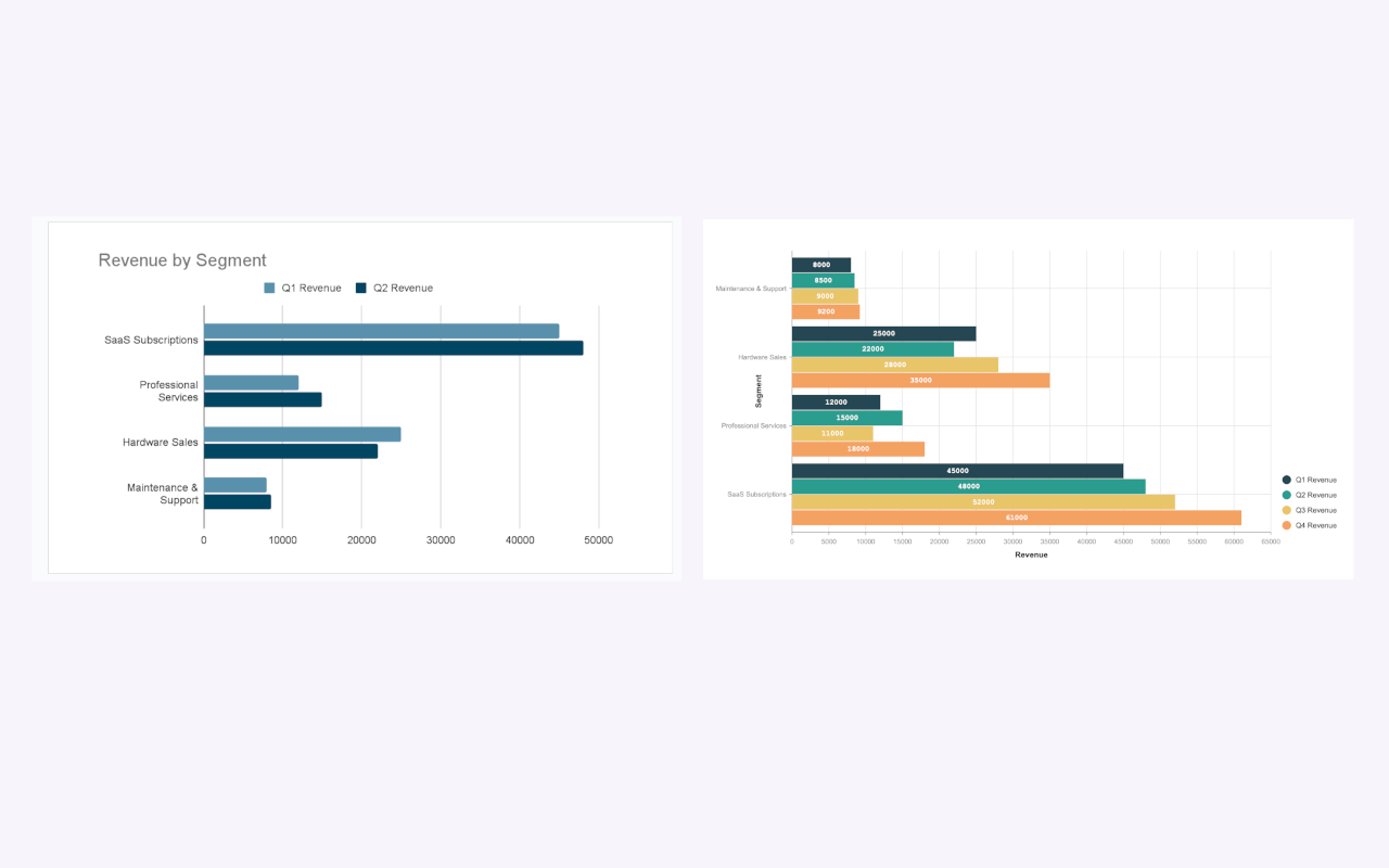
This isn't just about looks; it's about clarity. Your audience can now easily compare data points without getting a headache.
2. The Vague Sales Funnel
The "Before": Google Slides doesn't have a native Funnel Chart. Most people try to fake it with a stacked bar chart or a "Smart Art" pyramid, which is just plain wrong. A pyramid implies a foundation, while a funnel shows a process or drop-off. Using the wrong visual tells the wrong story.
The "After": A proper Funnel Chart. Using a dedicated chart type from ExtraChart means your visualization accurately represents the sales or marketing process. You can clearly see the conversion rate from one stage to the next. Add clean labels and on-brand colors, and you have a visual that tells a powerful story about your customer journey.

It’s the difference between saying "here are some numbers" and "here's where we're losing customers."
3. The "Which-is-Which?" Competitor Analysis
The "Before": You’re comparing three laptops across six different specs (Price, Battery, Performance, etc.). A grouped bar chart becomes a visual nightmare. It’s impossible to get a holistic view of which product is the best overall. Your audience is forced to jump back and forth, comparing individual bars.
The "After": A Radar Chart (or Spider Chart). This is the perfect tool for multi-variable comparison. Each product gets its own colored shape, making it incredibly easy to see which one has the best all-around performance at a glance. You can immediately spot strengths and weaknesses.
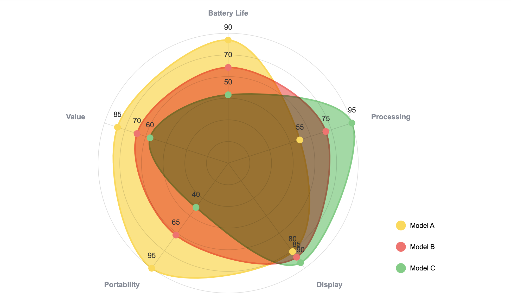
This chart type isn't available in Google Slides by default, but it's a game-changer for product comparisons, skills assessments, or brand perception analysis.
4. The Exploding 3D Pie Chart
The "Before": Please, just stop using 3D pie charts. They distort perception, making some slices look bigger than they actually are. The "exploded" view, where slices are pulled apart, only adds to the visual chaos. It’s a design trend from 1998 that needs to stay there.
The "After": A modern Donut Chart. By removing the center, you create a lighter, more modern visual. It's less "in your face" and focuses the reader's attention on the arc length of the slices, which is easier to compare. In ExtraChart, you can easily adjust the inner radius to get the perfect thickness and add a clear title or key metric in the center. It's the same data, presented with more class.
5. The "Spaghetti" Multi-Line Chart
The "Before": You're tracking the performance of four marketing channels over a year. The default line chart gives you four jagged, crisscrossing lines in hard-to-distinguish colors. It looks like a plate of spaghetti and is just as messy to interpret.
The "After": A clean, curved Multi-Line Chart. First, we apply a clear, high-contrast color palette. Second, we use the "Curved Line" option in ExtraChart to smooth out the data points, making trends easier to follow. Finally, we place the legend clearly at the top or bottom, not crammed on the side. The result is a chart that shows trends over time without overwhelming the viewer.
How It Works
The best part? You don't have to leave your presentation.
ExtraChart lives in your Google Slides sidebar. Just go to Extensions -> ExtraChart -> Create & Edit Charts.

You pick a chart, paste your data from Sheets or Excel into our editor, and customize everything from fonts to colors in the settings tab. When you're done, it inserts a crisp, high-resolution image onto your slide.
Need to update the data? Just select the chart image and open ExtraChart again. It remembers all your settings, so you can make changes in seconds.
Stop letting default charts undermine your hard work. Give your data the professional look it deserves.