Beyond Bar and Pie: 10 Powerful Chart Types Google Slides Can't Make (But You Can)
June 21, 2026
You’ve been there. You have a slide to make, data to show, and a point to prove. So you open Google Slides, click Insert > Chart, and stare at the familiar options: Bar, Column, Line, Pie.
They’re fine. They get the job done. But "fine" doesn't win pitches, impress stakeholders, or clearly explain complex ideas. Sometimes, a simple bar chart just can't tell the whole story.
What if you need to show conversion rates through a sales process? Or compare products across ten different features? You end up fumbling with external tools, screenshotting charts, and pasting static images that are a nightmare to update.
There’s a much, much better way.
Your Presentations Deserve Better Charts
The truth is, the most impactful data stories are often told with specialized charts. Visualizations that are custom-built to show relationships, progress, or distribution in ways a standard chart can’t.
Google Slides doesn’t offer these out of the box. But with the right tool, you can create them directly inside your presentation, and it’s easier than you think. Using our add-on, ExtraChart, you can stop wrestling with workarounds and start building professional, updatable charts in seconds.
Here are 10 powerful chart types you can create with ExtraChart that are impossible to make with Google Slides alone.
1. Funnel Chart
A funnel chart is essential for visualizing steps in a process and showing how quantities decrease at each stage. It's the go-to for sales pipelines, marketing conversions, or user onboarding flows.
- Why it’s powerful: Instantly highlights bottlenecks and drop-off points.
- Perfect for: Sales reports, marketing analytics, user journey mapping.

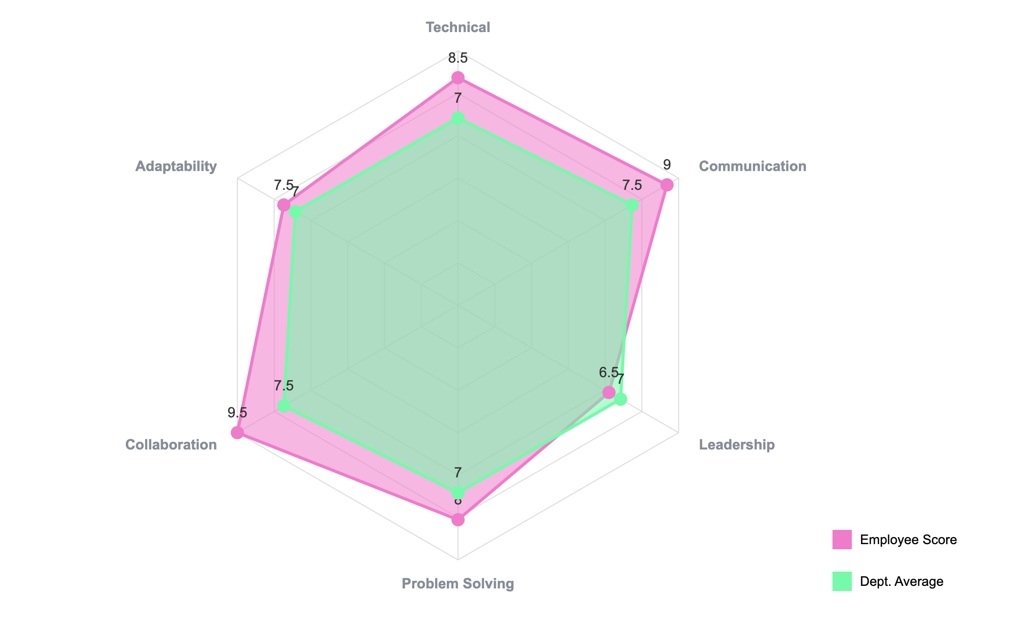
2. Radar Chart (Spider Chart)
Need to compare multiple items across several distinct categories? The radar chart is your best friend. It plots data points on different axes radiating from a central point, creating a unique "spider web" shape for each item.
- Why it’s powerful: Offers a quick, visual way to see which item is strongest or weakest across multiple metrics.
- Perfect for: Product feature comparisons, employee skill assessments, or brand perception analysis.
3. Bullet Chart
Invented by data viz expert Stephen Few, the bullet chart is a masterpiece of information density. It replaces bulky dashboard gauges by packing a target, a performance measure, and qualitative ranges (like poor, average, good) into a single, compact bar.
- Why it’s powerful: Shows KPI performance against a target at a glance.
- Perfect for: Dashboards, financial reports, and project status updates.
4. Box Plot (Box-and-Whisker Plot)
When an average isn't enough, a box plot shows you the full story of your data's distribution. It displays the median, quartiles, and potential outliers in a clean, statistical summary.
- Why it’s powerful: Reveals data skewness, spread, and outliers far better than a simple bar chart of averages.
- Perfect for: Scientific data, financial analysis, and any time you need to show statistical variance.
5. Heat Map
A heat map uses color to represent the magnitude of data in a two-dimensional matrix. Think of it as color-coding a table to make patterns, highs, and lows jump off the page.
- Why it’s powerful: Makes large, complex tables instantly understandable.
- Perfect for: User engagement on a website, financial market analysis, or survey results.
6. Stream Graph
A beautiful and artistic chart, the stream graph is a type of stacked area graph that flows around a central axis. It shows how the composition of a whole changes over time.
- Why it’s powerful: Excellent for visualizing trends and volume changes for multiple categories simultaneously.
- Perfect for: Tracking market share over time, analyzing website traffic sources, or showing demographic shifts.

7. Chord Diagram
Chord diagrams are designed to visualize the inter-relationships between entities. Each entity is a segment on the outside of a circle, and the connections between them are shown as "chords."
- Why it’s powerful: Uncovers complex relationships and flows in a single, compelling graphic.
- Perfect for: Migration data, economic flows, or network analysis.
8. Stepped Line Chart
Unlike a standard line chart that connects points directly, a stepped line chart uses only vertical and horizontal lines. This is perfect for showing changes that occur at discrete intervals.
- Why it’s powerful: Accurately represents data that changes at specific moments, not gradually over time.
- Perfect for: Interest rate changes, inventory levels, or price adjustments.
9. Donut & Half Pie Charts
While Google Slides has a basic pie chart, it lacks variations. A donut chart adds a clean, modern look by removing the center, while a half pie is perfect for visualizing progress toward a 100% goal.
- Why it’s powerful: Offers more design flexibility and a cleaner aesthetic than a standard pie.
- Perfect for: Budget breakdowns, survey results, and dashboard KPIs.
10. Scatter Plot
Okay, Google Slides technically has a scatter plot, but it's incredibly basic. ExtraChart gives you full control over point size, color, axes, and trendlines, turning it into a real analytical tool.
- Why it’s powerful: The best way to show the correlation and relationship between two different variables.
- Perfect for: Scientific data, market research, and quality control analysis.
How to Create These Charts in 30 Seconds
The best part? You don't need to be a data scientist or a graphic designer. With ExtraChart, it's a seamless part of your Google Slides workflow.
- Open ExtraChart: From your menu, go to
Extensions > ExtraChart > Create & Edit Charts. - Pick Your Chart: The sidebar opens with a clear, categorized list. Just click the icon for the chart you need.
- Add Your Data: A simple editor pops up. You can type your data in or, even better, copy-paste it directly from Google Sheets or Excel. The chart preview updates in real-time.
- Customize & Insert: Tweak colors, fonts, and labels in the Settings tab, then click "Create." A beautiful, high-resolution chart appears on your slide.
And the killer feature? Your charts are always updatable. Just select a chart you made, re-open ExtraChart, and you can edit the data or settings right where you left off. No more deleting and recreating.
Stop letting the default tools limit your data storytelling. Add ExtraChart to Google Slides and start creating the compelling, professional visualizations your work deserves.